

Match the message to its setting
The City of Tacoma economic development plan recognizes multiple neighborhood business districts. A single business may need a storefront notice, an event handout, a service sheet, or a phone-sized social graphic. These formats reach people in different moments, so each needs a deliberate hierarchy.
The Tacoma Narrows Bridges offer a recognizable visual cue for a Tacoma-inspired illustration, yet a landmark cannot carry the business message on its own. If a piece announces a service or event, the offer, timing, location, and next step must be legible at the size where it appears.
A resident passing a window may have seconds to read. Someone holding a capabilities sheet can spend longer. A phone user may only see a crop. Graphic design should account for those conditions, while the owner verifies current details and whether the chosen distribution reaches the intended audience.
Select the output from the communication task
Start by naming what customers miss or misunderstand. Are event details buried? Do staff repeatedly explain a service process? Does a referral piece fail to say what to do next? That question determines the message and format more reliably than asking for a flyer because another business has one.
A poster needs a fast read at a distance; a brochure can hold more depth; a digital tile needs larger type and a strong crop. Some tasks need a connected family of assets, with one visual approach adjusted for each size. Agree on destinations and use conditions before layout work begins.
A website can hold details that change. An identity system can make separate pieces recognizable as one business. The graphic’s short message should lead to a page or person prepared to continue the same conversation.

Make the hierarchy survive real scale
Decide what a viewer should notice first, understand second, and do third. For an event, the date and place may be decisive. For a service sheet, scope and fit may matter more. Supporting details should remain readable but should not compete with the main answer.
Test layouts at final size. A print design that looks spacious on a large monitor can become tiny on paper. A desktop preview can hide a crowded phone tile. Type, contrast, line length, margins, and image placement all affect whether the intended action is visible.
Keep essential words as text or clean typeset content, not buried in a scenic illustration. The bridge-inspired artwork on these pages is original conceptual imagery, not a documentary view or a customer project. A Tacoma motif should support recognition without making every local business look alike.

Create a system for repeated use
Galactic begins with the audience, required facts, brand assets, and planned placements. We establish content order, then explore type, color, imagery, and layout. Review asks whether a person can understand the message and act in the intended setting.
A reusable series can define heading styles, callouts, image treatments, and logo placement. That lets future pieces feel related without forcing identical compositions. It also reduces the work of deciding basic visual rules each time a date or offer changes.
Show us the Tacoma piece customers overlook or misunderstand, and we can plan a clearer design.
Print and digital versions need separate final checks. A street poster, counter card, square post, and vertical story have different viewing distances and crops. State every required output in the brief so important information is not cut off or reduced to unreadable type.

Request files that fit the use
A proposal should name finished pieces, dimensions, versions, revisions, and production specifications. Print may need bleed, color settings, and vendor-ready PDFs. Digital work may need several crops and text supplied separately so accessibility and future edits remain practical.
Clarify who writes and approves copy, who supplies photos and usage rights, and who handles printing or distribution. If a QR code is used, test its destination and scanning at final size. The call to action should still be understandable when someone cannot scan it.
Timing depends on content, number of formats, approval roles, and vendor deadlines. A small complete set can be more useful than many loosely connected drafts. Ask what editable files or update guidance are included at handoff.
Proof the actual customer-facing piece
Discovery gathers the goal, audience, current materials, brand files, and intended placements. A content hierarchy guides early concepts. Review should identify missing facts and confusing emphasis before polishing decoration.
Refinement addresses readability, accuracy, and production fit. Inspect print at intended scale and screen assets on a phone. Verify dates, URLs, phone numbers supplied for the business piece, and image permissions before export. Those business details should not be guessed by the designer.
Delivery should organize approved files by use so staff can find the right version. Record any rules for future updates. Time-sensitive materials also need an owner responsible for removing or revising them after the offer or event changes.

Evaluate portfolio pieces by clarity
Galactic’s graphic portfolio contains work completed for businesses elsewhere. It demonstrates design output, not Tacoma projects or verified campaign results. Study how each piece guides attention and whether the key message survives its format.
Bring a real draft, a recurring customer question, or a piece staff struggle to use. That can reveal whether the problem is copy, hierarchy, inconsistent identity, or the page the piece sends people to. The resulting scope can be more specific than a broad request for marketing materials.
An effective graphic supports a wider customer experience. A polished handout cannot repair an outdated destination or unclear offer. When the piece, site, and staff response agree, customers have a more coherent path from first glance to the next step.
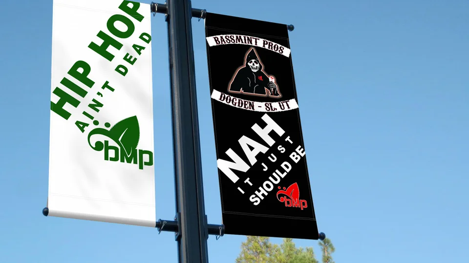
Questions about graphic design in Tacoma
Can one design cover print and social?
A shared concept can, but each format needs its own layout and final-size review.
Do we need final copy first?
Core facts and an approved message are needed. Copy development can be included in a defined scope.
Can we use a bridge illustration?
Yes, as a conceptual local cue when it fits the message; it should not imply a real site photo or client project.
Is printing included?
Confirm vendor and production responsibilities in the proposal. Design files and physical printing are separate deliverables.
What makes a piece effective?
A clear audience, accurate information, readable hierarchy, and a working next step in the chosen channel.
Ready for a useful next step?
Help the next message get understood.
Share the piece, audience, and placement. We can plan a useful Tacoma graphic design deliverable.
Discuss your Tacoma project