
A Las Vegas identity should express the business, not a cliché
The City of Las Vegas describes varied downtown business areas, from the Arts District to retail and professional services. A mark for a local practice, a restaurant, or a business supplier should reflect its actual audience and uses. Neon, dice, and casino motifs may feel familiar, but they can make unrelated businesses harder to distinguish.
A hypothetical neighborhood service may need a readable vehicle mark and document header. A hypothetical maker may need packaging and a compact social icon. A hypothetical consultant may need a restrained proposal system. These are design-planning examples, not Galactic Las Vegas clients.
Galactic Digital Studios develops identity systems that can work across sizes and media. A logo helps people connect repeated experiences with the same business; it does not explain the entire offer by itself.
Start with positioning and real applications
Clarify the business name, audience, offer, and qualities the identity should communicate. List where the mark will appear: website, invoice, sign, packaging, uniform, or presentation. The smallest and largest applications reveal different constraints.
If an existing mark has recognition, identify which parts remain useful. A refresh may solve legibility or consistency problems without discarding everything. If the business name or service model is still changing, settle those decisions before final artwork.
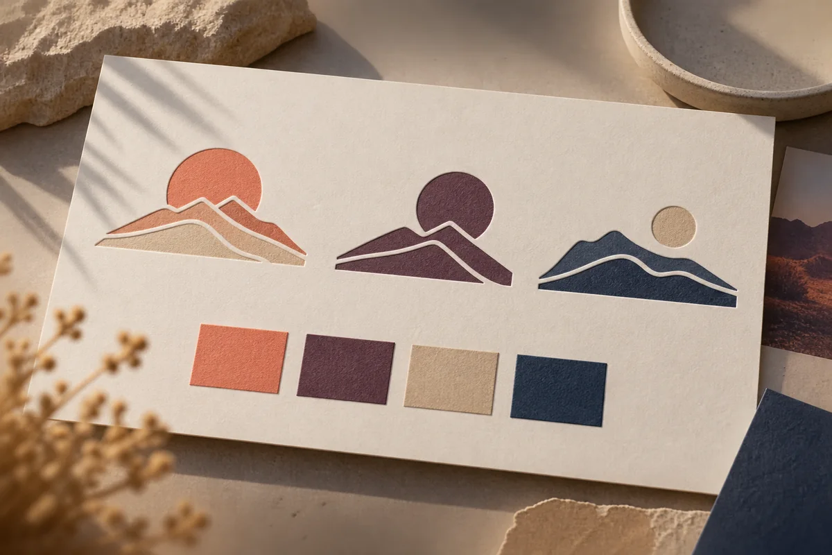
The hero shows original AI-generated conceptual studies based on generic desert forms. They are not a commissioned Las Vegas identity or trademark clearance. A real logo would need a brief specific to the business and appropriate review before adoption.
Test a concept before choosing a favorite
Ask whether the mark reads at ordinary sizes, works in one color, and feels appropriate for the intended audience. View it beside the exact business name, on light and dark backgrounds, and in the formats the team will use. A large mockup alone can hide small-size failures.
Feedback is strongest when it names a practical issue: a symbol loses detail, a wordmark is difficult to read, or the tone suggests the wrong service. Personal taste matters, but it should be weighed with use and audience fit.
Identity design is not legal clearance. The USPTO explains that marks need not be identical to create confusion. A business should arrange appropriate trademark research or legal review before commercial adoption; we do not claim that any concept is available in every market.

Plan variations and a handoff the team can use
A useful system may include a full lockup, compact variation, one-color version, color guidance, spacing rules, and files for print and screens. The proposal should name exactly which versions and source files are included and what rights transfer under the agreement.
Ask how staff and vendors will find the approved assets. A simple usage guide prevents stretching, improvised colors, and screenshots from becoming the default logo file. If a typeface or other component has separate licensing terms, identify them before handoff.
Cost and timing depend on the number of applications, naming certainty, stakeholder reviews, and required collateral. A project-specific scope is more reliable than a fixed promise made before those details are known.
Let’s define where your Las Vegas identity must work before choosing a visual direction.
Connect the mark to the larger customer experience
We use discovery to understand audience and use cases, explore visual directions, refine a chosen route, and test it in agreed applications. Delivery prepares the specified variants and guidance. Mockups help evaluate context, but they do not claim physical production.
Las Vegas web development can explain the offer in depth, while Las Vegas graphic design can extend the identity into guides and presentations. The same message should carry through those touchpoints without making every layout identical.
Consistency can support recognition and credibility over time. It cannot guarantee leads, rankings, or sales. The offer, customer experience, reach, and reputation also influence results.

Avoid borrowed signs, artwork, and implied affiliation
Las Vegas contains many memorable visual identities, but a new business should not imitate a recognizable casino mark, venue sign, mural, or event identity. Original desert geometry can suggest place without copying another owner’s work or claiming an association.
For a real identity, evaluate distinctive concepts against the business category and intended uses. Professional clearance may be appropriate before major investment in signs, packaging, or registration. A design proposal should not be mistaken for a legal opinion.
Keep the final name and mark consistent across accounts and materials after approval. A staged rollout can be practical, but staff should know which files are current so customers do not see conflicting versions.
Move from discovery to a dependable handoff
Discovery collects the business story, audience, old assets, and applications. Direction explores concepts against that brief. Refinement tests a selected direction for legibility and flexibility. Handoff supplies the agreed files and guidance.
The business confirms its exact name and any legal review. If several stakeholders are involved, consolidated feedback helps the work move forward. After delivery, store approved files where staff and vendors can access them and archive older versions separately.
A mark becomes useful through consistent real-world application. Later materials should begin from the approved source files, not a low-resolution screenshot or a redrawn approximation.
Review portfolio examples for decisions, not claims
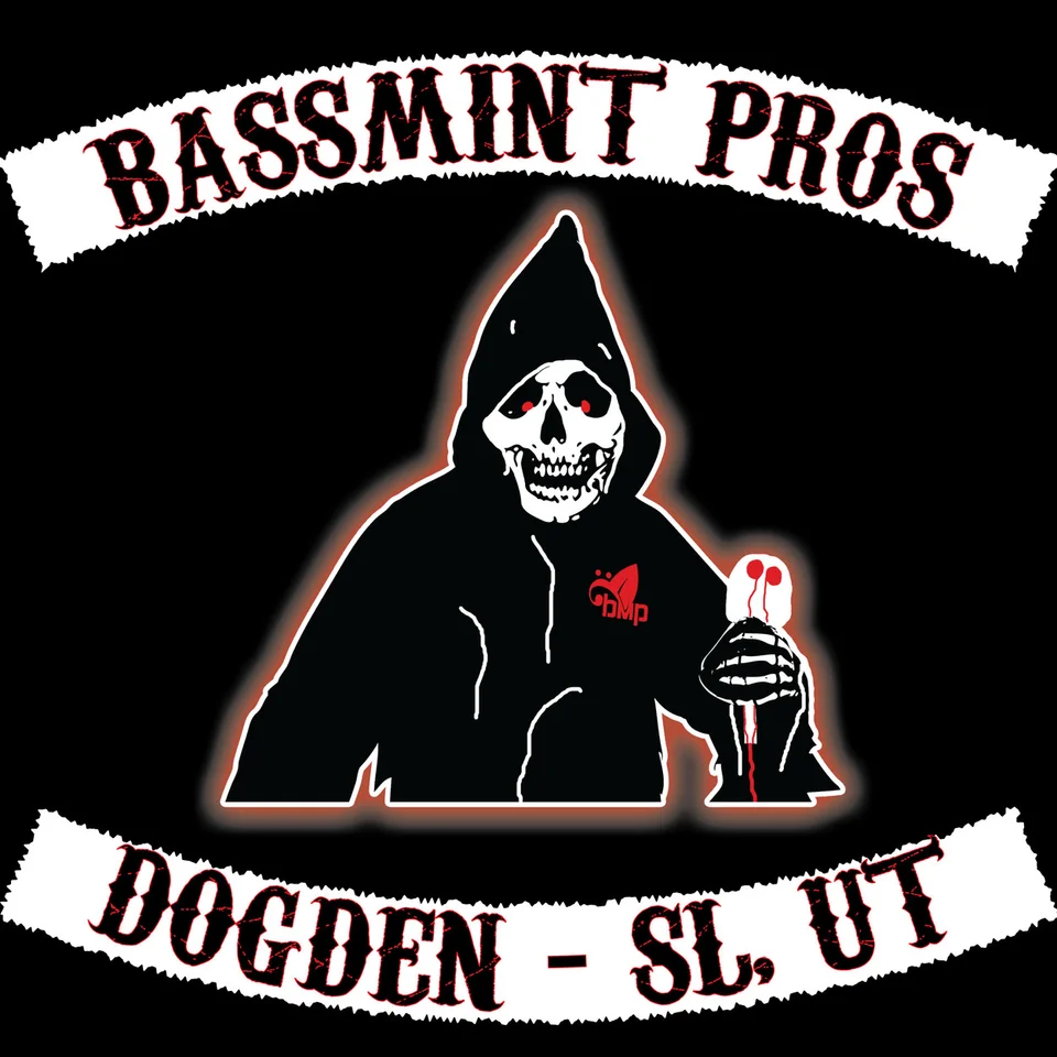
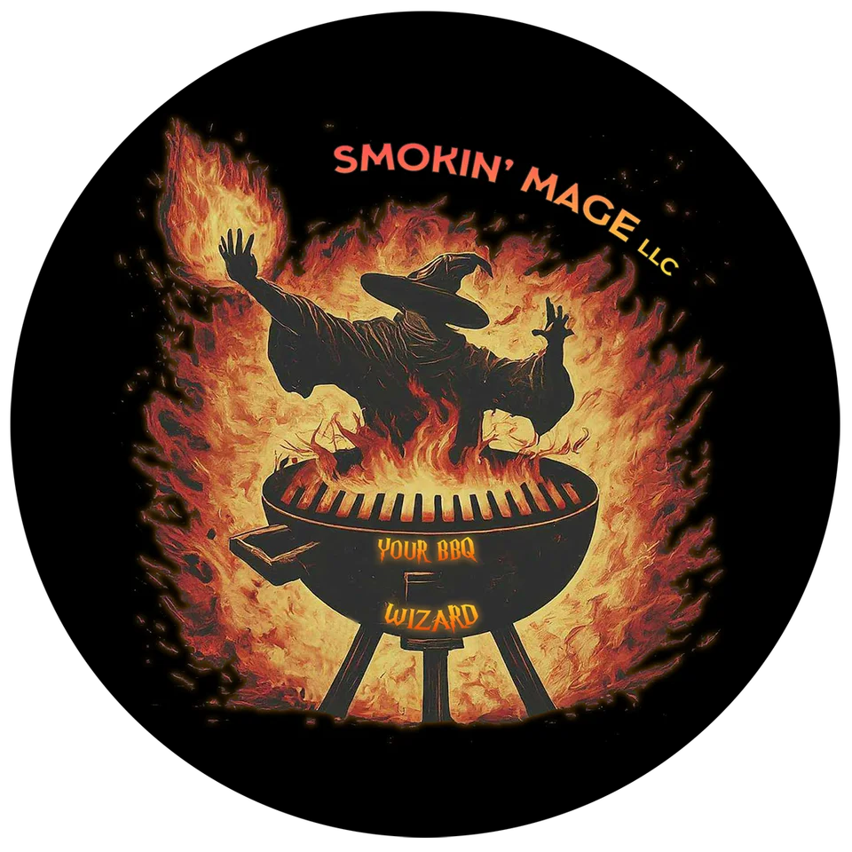
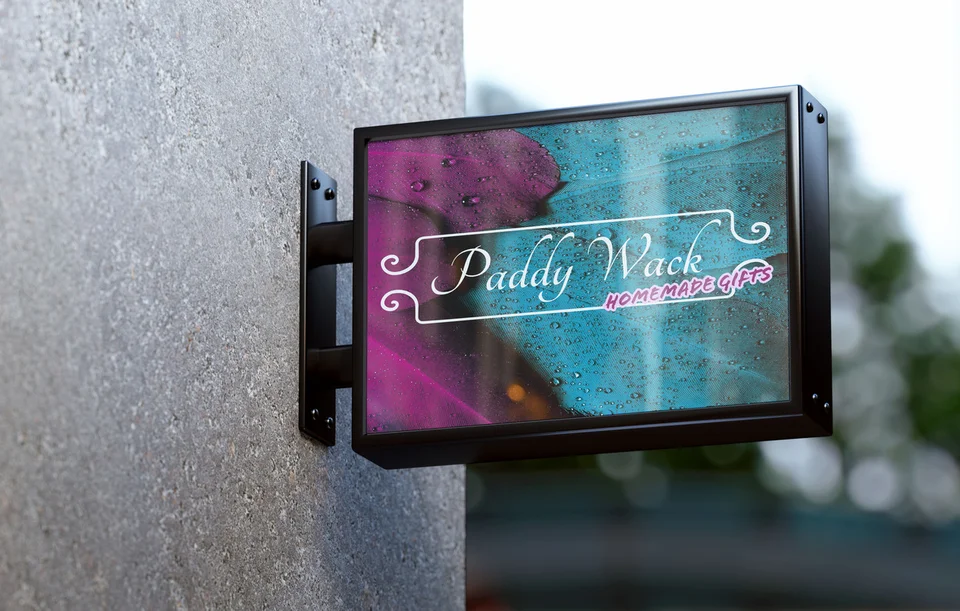
The Galactic portfolio includes Bassmint Pros, The Silver Guardian, Smokin’ Mage LLC, and Sooo Good Lemonade identity work. These are not Las Vegas commissions, verified installations, or proof of business results. Ask how each mark relates to its audience and use.
Our studio background provides more context. A useful proposal should still define your applications, rights, file handoff, and review process. The conceptual desert studies in the hero are separate from the portfolio.
The strongest Las Vegas identity should help customers recognize your particular business, whether it serves residents, visitors, or other companies. Its value comes from fit and repeated use, not from borrowing the city’s most familiar symbols.
Questions about logo design in Las Vegas
Should a Las Vegas logo use neon or casino imagery?
Only when those motifs truly fit the business and can be used originally. They are not a requirement for local relevance.
What files will we receive?
Agree on vector and web-ready files, color and one-color versions, and any compact mark in the project scope.
Can we keep part of our old logo?
Often. We review recognition and practical weaknesses before deciding whether to refresh or replace it.
Is a proposed logo legally clear?
Design work is not trademark clearance. Arrange appropriate research or legal review before commercial adoption.
Can the identity guide future materials?
Yes. Variations, colors, typography direction, and usage rules can give web and graphic work a consistent starting point.
Ready for a useful next step?
Build a mark your team can use with confidence.
Tell us what customers need to understand and where your current materials fall short. We can discuss a focused scope for your Las Vegas business and the information needed to begin.
Discuss your Las Vegas project