

Make the message easier to evaluate
Graphic design for Bellevue businesses presenting their next idea
Galactic Digital Studios offers graphic design for small businesses in Bellevue, Washington. We help organize information into materials that look connected, read clearly, and support a business decision. That may involve a sales piece, a proposal presentation, a digital campaign graphic, or artwork intended for print.
Bellevue’s business-district guide describes settings as varied as BelRed’s arts community, Crossroads’ shops and services, and Eastgate/Factoria’s offices. The design needs of an independent creative business can differ from those of a company presenting a specialized service. The brief should recognize that difference.
We work remotely with Bellevue owners and teams to establish what the reader needs to understand and how the material will be used. The goal is a presentation that gives useful information a clear order while preserving the character of your business.

Choose the job before the format
What decision should this piece support?
Understand the offer
An introductory piece should explain what the business does and who it helps. Give the reader a clear starting point before adding supporting details. A strong hierarchy makes the main message apparent at a glance.
Compare the details
A service sheet or proposal presentation may need more structure. Group related information, distinguish options, and make important qualifications easy to find. The reader should be able to revisit a section without rereading everything.
Remember the business
A campaign graphic or physical piece should connect with the identity people encounter elsewhere. Consistent typography, color, and image treatment help the new message feel like part of a recognizable business.
Design for the person who receives the forwarded document
Consider a hypothetical Bellevue service business whose introduction is shared between several decision-makers. The first person may have heard the explanation in a meeting. The next person may see only the document. A useful design carries enough context to make sense on its own, with headings and supporting details that show how the offer fits together.
That does not mean putting every possible answer on the first page. It means separating the main proposition, the relevant detail, and the next step. A clear summary can introduce the work, while a more detailed section explains scope or options. The layout should make that relationship visible.
Bring existing text and examples of how the material is distributed. A screen presentation, an emailed document, and a printed handout can require different proportions and levels of detail. Identifying those uses early helps determine whether the project needs one layout or several coordinated versions.
A visual system with a clear purpose
Turn complexity into a readable sequence
Our strategic approach begins by identifying the reader’s questions and the information needed to answer them. We use typography, spacing, color, and imagery to show priority and relationships. The design should help someone understand the message rather than make them work around decorative choices.
Consistency becomes especially useful when different team members create or distribute materials. An agreed approach to headings, imagery, and recurring elements can keep the business recognizable while allowing different messages. We discuss whether the project needs finished pieces, editable templates, or a more developed set of usage rules.
Clear graphic design can support visibility, credibility, and branding by making a message easier to notice and assess. A relevant offer and a clear next step can help support inquiries. The effect on leads and growth also depends on distribution, timing, and the business itself, so design decisions should be evaluated against their communication purpose.
Define versions, approvals, and production before delivery
A useful asset list names the actual pieces and their intended uses. Identify dimensions, page counts where relevant, digital placements, and print requirements. If one concept must work across several formats, allow for adaptation. Shrinking a layout is not always enough to preserve its reading order.
Give business claims, figures, product details, and final text a clear approval owner. If several people review the work, gather their comments before sending direction. Separate corrections from new requirements so the effect of a change on scope and timing can be discussed openly.
For print, obtain the vendor’s specifications before final preparation and clarify responsibility for proofing and physical production. For digital materials, decide which files need to be editable and which are final outputs. Font and image licensing, software access, and source-file delivery should be addressed in the agreement.
If the visual identity needs refinement, start with Bellevue logo design. If the materials direct people to an online experience, coordinate Bellevue web development so the destination carries the same message and provides a useful next action.
Keep the review grounded in the brief
From information gathering to organized artwork
Define the reader and use
Review the audience, communication goal, existing materials, and required formats. Identify content gaps and collect the identity files and production specifications needed for the work.
Establish the hierarchy
Develop a representative layout that gives the information a clear order. Explain the design choices in relation to the brief, then assess whether the message is understandable in its intended setting.
Refine and adapt
Apply consolidated feedback and create the agreed versions. Check how changes in size or format affect the content. Confirm text accuracy before final output preparation.
Deliver with uses clarified
Organize the files and identify which versions serve which applications. Confirm any editable materials and guidance included. Record remaining production or future adaptation responsibilities.
Use the portfolio to discuss hierarchy and application
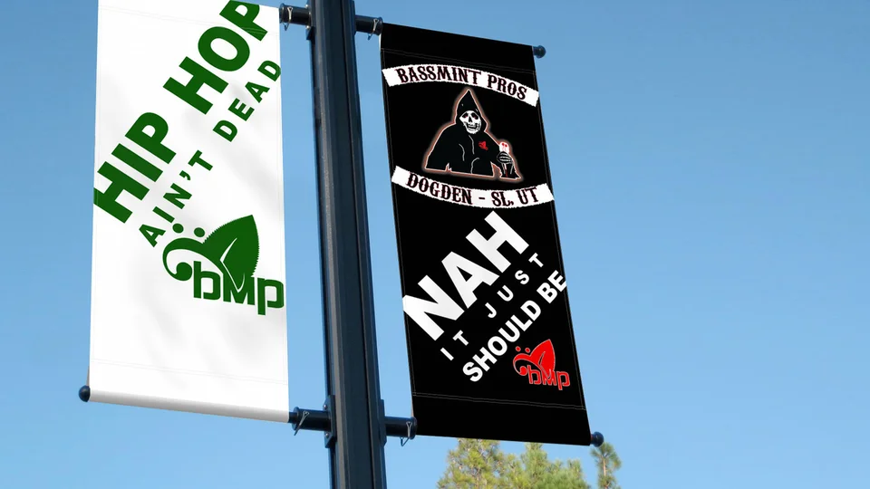
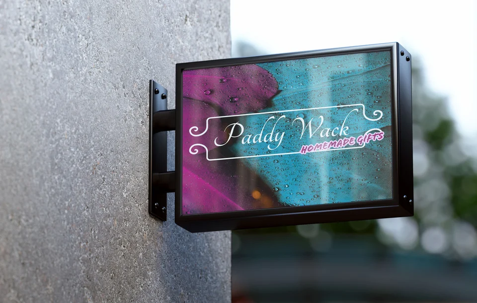
The examples on this page include graphic presentations and identity work from Galactic’s existing portfolio. The environmental campaign billboard, Bassmint Pros banner, and Paddy Wack Homemade Gifts sign mockup show artwork in different formats. The logo selections illustrate identity choices that can inform a broader visual system.
Captions identify those disciplines. These are not claimed Bellevue commissions, and a mockup is not proof that an installation was produced. The examples are useful for examining scale, emphasis, and visual character, then discussing what your own materials need to achieve.
Galactic’s design services developed alongside the web work that began in 2015. You can explore the full portfolio and studio background before discussing a project. Ask how the proposed process will turn your content into usable deliverables and how the review stages protect clarity.

Keep communication clear across a wider audience
The city describes Bellevue as an international and multicultural community. For design, that is a reason to ask who the intended reader is rather than assume shared terminology or background knowledge. Clear labels and a readable hierarchy make the message easier to approach.
If your business needs materials in more than one language, raise that requirement at the start. Text length, typography, approval, and translation responsibilities affect layout and timing. Any translated content should have a qualified reviewer; design can support the presentation but does not replace language expertise.
For businesses working elsewhere on the Eastside, explore Redmond graphic design and Kirkland graphic design. The Bellevue services overview helps place those materials within a broader website and identity plan.

Bellevue graphic design questions
Can you help make a complex service document clearer?
Yes. Start by identifying the reader and the decision the document supports. We can discuss how headings, grouping, spacing, and visual emphasis can make approved information easier to understand.
Can our team edit the material later?
Discuss that need before the project begins. The file format, software, fonts, and layout should match the changes your team expects to make. Editable templates and guidance should be explicitly included in the scope.
What if several people need to approve the design?
Agree on an approval process and nominate someone to consolidate feedback. That allows different expertise to inform the work while avoiding contradictory directions and repeated changes to previously approved decisions.
How is a set of materials priced?
The number of concepts, formats, adaptations, content needs, and review stages affects the work. Provide a complete asset list and identify production expenses so the estimate explains what is included.
Can one design work for both print and digital use?
It can share a direction across both, but each output needs appropriate preparation. Screen proportions, physical dimensions, and production requirements may call for different layouts or file versions.
Give the information a clear form
Make your next business conversation easier to start.
Your materials should carry the message with enough clarity to be understood, shared, and used. Bring the content and applications your Bellevue business needs, and let’s define a coherent design direction.
Plan your Bellevue design materials