
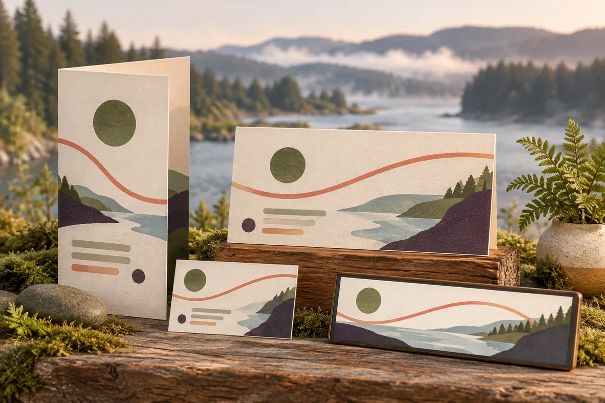
Give useful information a form people can keep
Graphic design for Castle Rock businesses
Galactic Digital Studios provides graphic design for small businesses in Castle Rock, Washington. We help turn service explanations, introductions, and announcements into readable materials with a clear purpose. A good piece should make sense when someone first sees it and when they return to it later.
The city's introduction highlights a historic downtown with shops, dining, and accommodations. A business in that setting may need materials that help a new visitor understand the offer, while a local service provider may need something that supports a longer buying decision.
We start with the message, audience, and intended use. A leaflet, counter card, service sheet, and digital announcement can share a recognizable identity while carrying different amounts of information. The format should follow the reader's need.
Think about what happens after the handoff
What should someone remember from the piece?
What the business offers
Make the service or purpose understandable without a spoken explanation. A take-away piece may be read later by someone who was not part of the original conversation.
Why the information matters
Give the reader enough context to assess relevance. Organize service categories, useful distinctions, or preparation details around the decision they are trying to make.
How to continue
Choose a next step that fits the material. A printed introduction might lead to a fuller explanation online, while a service sheet may help someone prepare a more useful inquiry.
Match the lifespan of the material to the information
Some details belong on durable printed pieces; others change too often to print in a large batch. Decide which parts of the message are likely to remain useful and which should live on an actively maintained page. That choice can reduce confusion and avoid unnecessary replacement work.
For a hypothetical Castle Rock shop, a compact introduction could describe the core offer while directing people to current arrangements online. A local repair business might use a service sheet explaining accepted work and what information helps assess a request. These are planning examples, not claims about completed local commissions.
A link or QR code should lead somewhere useful and clearly described. Check the destination on mobile and test any code at the final printed size. The design needs to connect the physical material with an understandable next step, not simply add a code because space is available.

Readable structure before extra decoration
Build a message that survives different viewing situations
Galactic's approach begins with hierarchy: what should be noticed first, what needs explanation, and what the reader should do next. Type size, contrast, spacing, and imagery support that sequence. The business's personality should come through without making basic information difficult to find.
A counter sign has different demands from a folded guide or a small screen graphic. We adapt the composition to the viewing distance, proportions, and amount of text. Consistent colors and type choices connect the versions while allowing each to do its own job.
Clear graphic materials support visibility by making the message easier to notice and credibility through careful presentation. A consistent identity reinforces branding, and a relevant action can support leads. Reusable design decisions also help future communications remain coherent. For online use, pair important graphics with readable text so information stays available beyond the image.
Let’s create Castle Rock business materials that stay clear from the first glance to the next step.
Define the content and production requirements early
List the pieces, dimensions, intended uses, and versions you need. Explain whether the work is a one-time announcement or a foundation for recurring materials. Several unique messages require a different scope from one design adapted to a few sizes.
Identify who supplies and verifies copy, photography, prices, and any dated information. If additional language versions are needed, plan approved text and qualified review before final layout. Changes in text length can affect the design and production schedule.
Ask the printer or sign producer for specifications before artwork is finalized. Confirm who manages proof approval, printing, delivery, and installation where relevant. Design and physical production should have clear responsibilities rather than assumed inclusions.
Discuss finished exports, editable templates, source files, font and image permissions, and future updates. Budget and timing depend on these requirements and review turnaround. Coordinate logo design if the identity needs attention, and web development if the materials lead to a page that needs improving.
Make every version ready for its purpose
From the message brief to finished materials
Plan the information
Define the audience, message, and action. Gather identity files and draft content. Separate lasting information from details that need regular updates, and confirm output requirements.
Establish a representative design
Develop a layout using realistic text and imagery. Review hierarchy, tone, and reading order before adapting the direction across every format.
Check each application
Refine the set and verify wording, image quality, margins, folds, and dimensions. Test links or codes and review the destination. Confirm the final text in every version.
Prepare delivery and maintenance
Export the agreed files and identify where each belongs. Coordinate proofs where included. Explain template use and assign responsibility for future revisions or expired material.
Look for decisions that help the message work
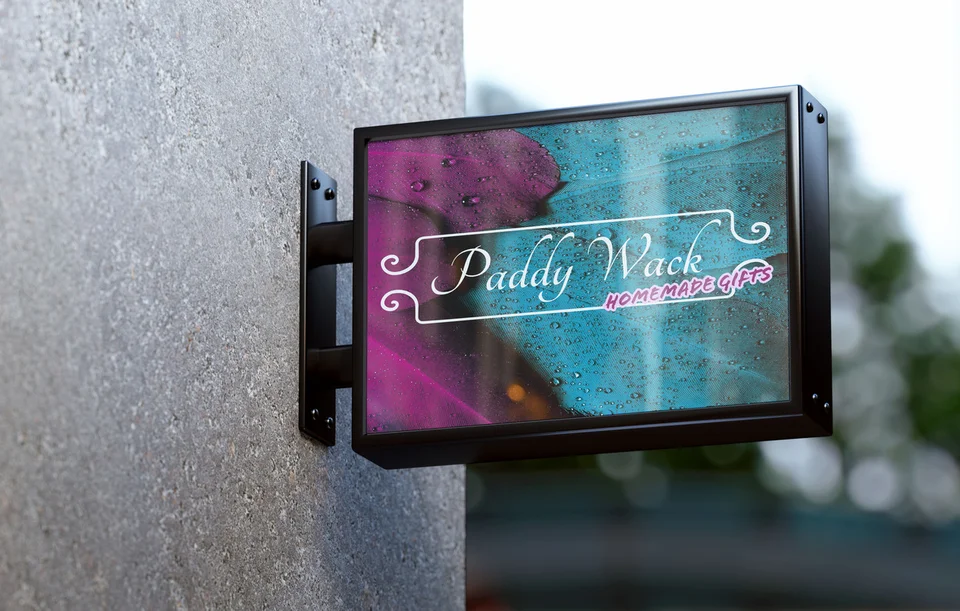
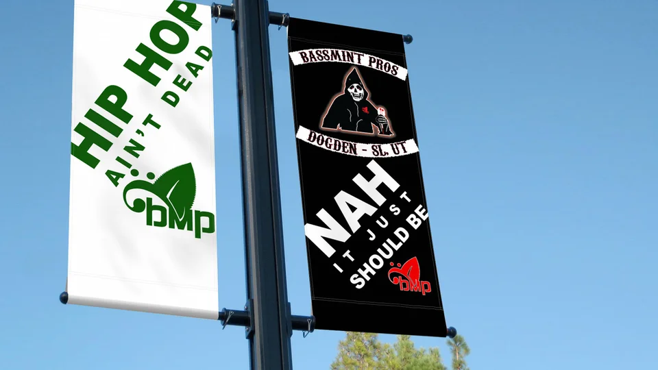
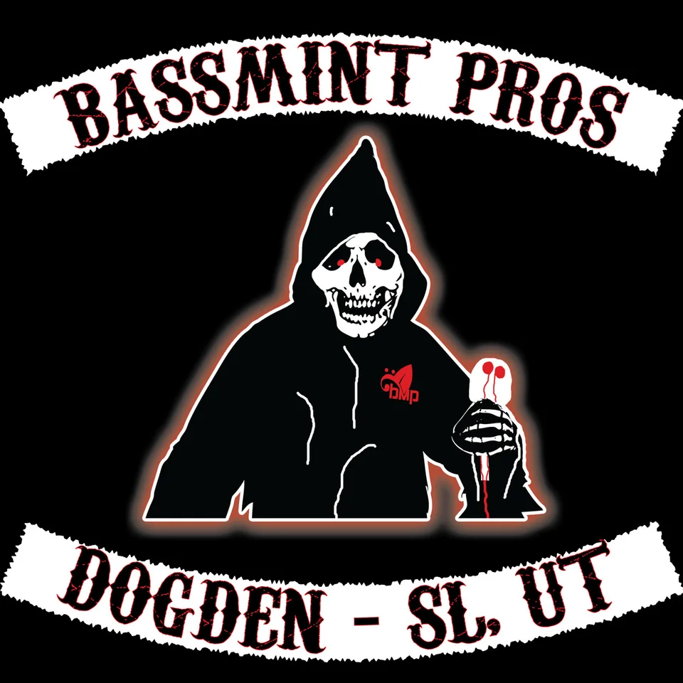
The examples shown include PaddyWack Homemade Gifts sign artwork, an environmental campaign billboard presentation, and Bassmint Pros graphics. Logo examples demonstrate how a recognizable identity can provide a foundation for other materials.
Review what each composition emphasizes and how the visual style relates to the subject. Those are useful points for discussing your own requirements. A mockup demonstrates a presentation context; it does not establish a physical installation or measured commercial outcome.
These selections come from Galactic's existing portfolio, not a claimed set of Castle Rock projects. The studio background provides more context about its web and design work. Ask how the proposed deliverables and review process will fit your specific materials.
Communicate beyond the visitor introduction
Castle Rock's city FAQ includes everyday businesses such as repair, hardware, and personal services alongside visitor-oriented offerings. Local graphic design can support those routine needs as well as an introduction for someone passing through.
Let the actual customer question guide the material. A service checklist, introductory sheet, or appointment card may be more useful than a broad promotional brochure. Regional imagery can support the tone, but it should not crowd out the details that help someone choose or prepare.
If your audience extends farther, explore Longview graphic design. The Castle Rock digital services overview connects printed and digital materials with the website and identity that support them.

Castle Rock graphic design questions
What belongs on a business leaflet?
Include a clear offer, enough context to assess relevance, and a useful next step. Prioritize information likely to remain accurate for the life of the printed piece.
Should changing details stay on the website?
Often that is practical, provided someone maintains the page. Use printed materials to introduce the business and direct people to current details when those change frequently.
Can the same visual direction work on a counter sign and a phone?
Yes, with layout adaptations. Review reading distance, proportions, and text size for each use rather than shrinking the same artwork into every format.
Can we receive templates for future updates?
Discuss templates, source files, and the software your team uses in the scope. Agree on which elements can change and what guidance is needed to preserve consistency.
How do we avoid printing an outdated version?
Use clear file names and one approved source of final content. Assign proof approval to a responsible person and check dates, details, and destinations immediately before production.
Give useful information a lasting impression
Make your Castle Rock materials worth keeping.
Bring the message and the ways customers will encounter it. We can help create clear, recognizable pieces that explain the business and make the next step easier to follow.
Discuss your Castle Rock graphics