

A local cue should support a distinct business
Pierce County describes South Hill as an unincorporated community with neighborhoods and commercial centers. A business can reflect that setting in its identity, but a mountain, road, or tree alone will not explain what makes it different. The mark should be designed for the business’s own audience, name, and applications.
A hypothetical contractor may depend on vehicle graphics and work shirts; a shop may rely on window signage and packaging; a professional service may appear mostly on screens and documents. Those settings change what counts as a successful logo. A detailed illustration can look impressive at presentation size yet become unreadable in a small profile image.
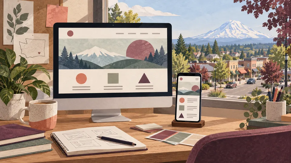
Galactic Digital Studios uses local context to shape the brief without claiming a South Hill office or client project. The imagery on this page is a generated concept, not a proposed mark. An actual identity should emerge from the owner’s business goals and be tested wherever customers will meet it.
Decide what should change and what should remain familiar
Look at the current identity before requesting a new one. Is the business name hard to read? Are files missing? Does the mark break in one color? Are different versions used by staff? A controlled refresh may solve these issues while preserving recognition. A full redesign makes more sense when the business itself has changed substantially.
List the applications that matter now and in the next phase. If a sign must be replaced, know its shape and viewing distance. If a website is being rebuilt, know how the mark appears in its header and mobile menu. These constraints help choose a direction grounded in use rather than a concept that only works on a large board.
Write a brief with the exact business name, audiences, service position, desired tone, and relevant competitors. Do not ask a symbol to carry every promise. The website and customer materials can explain services; the logo gives the business a recognizable anchor across them.

Test the mark before choosing a favorite
Compare concepts at small and large sizes, in full color and one color. Test them beside real copy rather than placeholder text. Does the name remain readable? Is the shape distinguishable from nearby competitors? Can someone tell the primary and alternate versions belong to the same business?
Color and type are part of the identity, not decoration around the symbol. Contrast affects use on light and dark backgrounds. Spacing protects the mark from crowded layouts. A horizontal arrangement may work on a sign while a compact version helps in an avatar. The brief should name which versions are needed rather than assume one file will cover all uses.
Visual research can help avoid obvious similarities, but it is not formal trademark clearance. If the owner needs legal assurance before launch, that is a separate professional review. The design scope should describe what is included and avoid implying that a creative presentation is a legal opinion.

Build a usable identity system
Galactic starts with the business story, audience, and use cases. Initial directions are evaluated against that brief. Refinement then addresses legibility, distinction, tone, and fit across planned applications. A practical result includes approved variations and guidance, not a folder of unexplained alternatives.
An identity system can connect South Hill graphic materials, web pages, forms, and physical touchpoints. Consistency helps customers recognize the business as they move between channels. It should also make staff’s choices easier: which mark goes on a dark background, what type to use, and how much space the logo needs.
Rollout may happen in stages. A business with existing inventory, signs, vehicles, and digital channels should decide which items change first. That plan keeps recognition intact and avoids ordering materials before the files and rules are approved. A small, controlled system is often more useful than many unrelated options.
Ask exactly what the final files include
A proposal should explain discovery, exploration, review, refinement, application tests, and handoff. The number of concepts is only one detail. More important is whether the process addresses the actual environments where the mark will appear and whether the owner can use the final identity consistently.
Confirm screen and print exports, transparent backgrounds, one-color versions, and any editable source files. Ask about fonts and other licensed elements, usage rights, and whether a short identity guide is included. The owner should understand what can be supplied to a printer, sign maker, or web developer without rebuilding the mark.
Cost and timing depend on the brief, number of decision makers, research and exploration, applications, and approvals. If a business is changing its name or needs formal trademark review, those are separate considerations. A clear scope is more useful than a fixed estimate made before these factors are known.
Move from business brief to controlled rollout
Discovery identifies what customers already recognize and why change is needed. Initial directions are reviewed against that purpose, not only personal taste. Feedback should point to a practical concern such as poor readability, an unwanted tone, or weak distinction. That gives refinement a clear target.
Test the selected direction on a website header, document, small avatar, and relevant physical surface. Review the mark in one color and at the sizes it will actually be used. Final preparation can then provide approved files and simple usage rules. The owner should know which variation belongs in each setting.
Launch the system in a planned sequence. Update the customer touchpoints people see most often, then work through older materials as operations allow. A partial change can be managed when the team has a clear rule for new work. The finished identity should be easy for staff and vendors to apply without improvisation.

Use portfolio examples as evidence of design output
Galactic’s identity portfolio shows completed marks and applications for businesses elsewhere. They are not South Hill commissions or measured growth stories. Review them for practical questions: is the name readable, do the forms scale, and does the system feel coherent across different materials?
Bring your existing logo files and examples of where they appear. A comparison can reveal whether you need a redesign, a refresh, or simply better variations and guidance. A portfolio image may suggest a style, but your brief should decide the direction because your audience and applications are different.
A logo can support recognition and consistency. It cannot guarantee sales, search placement, or trust by itself. Those outcomes also depend on service quality, accurate information, and the customer experience. The identity should work with the rest of the business communication rather than carry it alone.

Questions about logo design in South Hill
Can you refresh a logo instead of replacing it?
Yes, when familiar elements still serve the business. The brief should identify what needs repair and what customers recognize.
Should a South Hill logo include Mount Rainier?
Only if it helps distinguish the business and suits its use. A local motif is optional and can become generic when overused.
What files should I request?
Confirm screen, print, transparent, and one-color exports, plus any agreed editable files and usage guidance.
Is trademark clearance included?
A design review is not legal clearance. Arrange separate professional review if formal clearance matters to the launch.
How long will the project take?
Timing depends on brief quality, applications, decision makers, feedback, and any outside approvals. A proposal should describe the steps.
Ready for a useful next step?
Give your business a mark it can use confidently.
Tell us where the current identity breaks down and which applications matter most. We can discuss a practical logo design scope for your South Hill business.
Discuss your South Hill project