
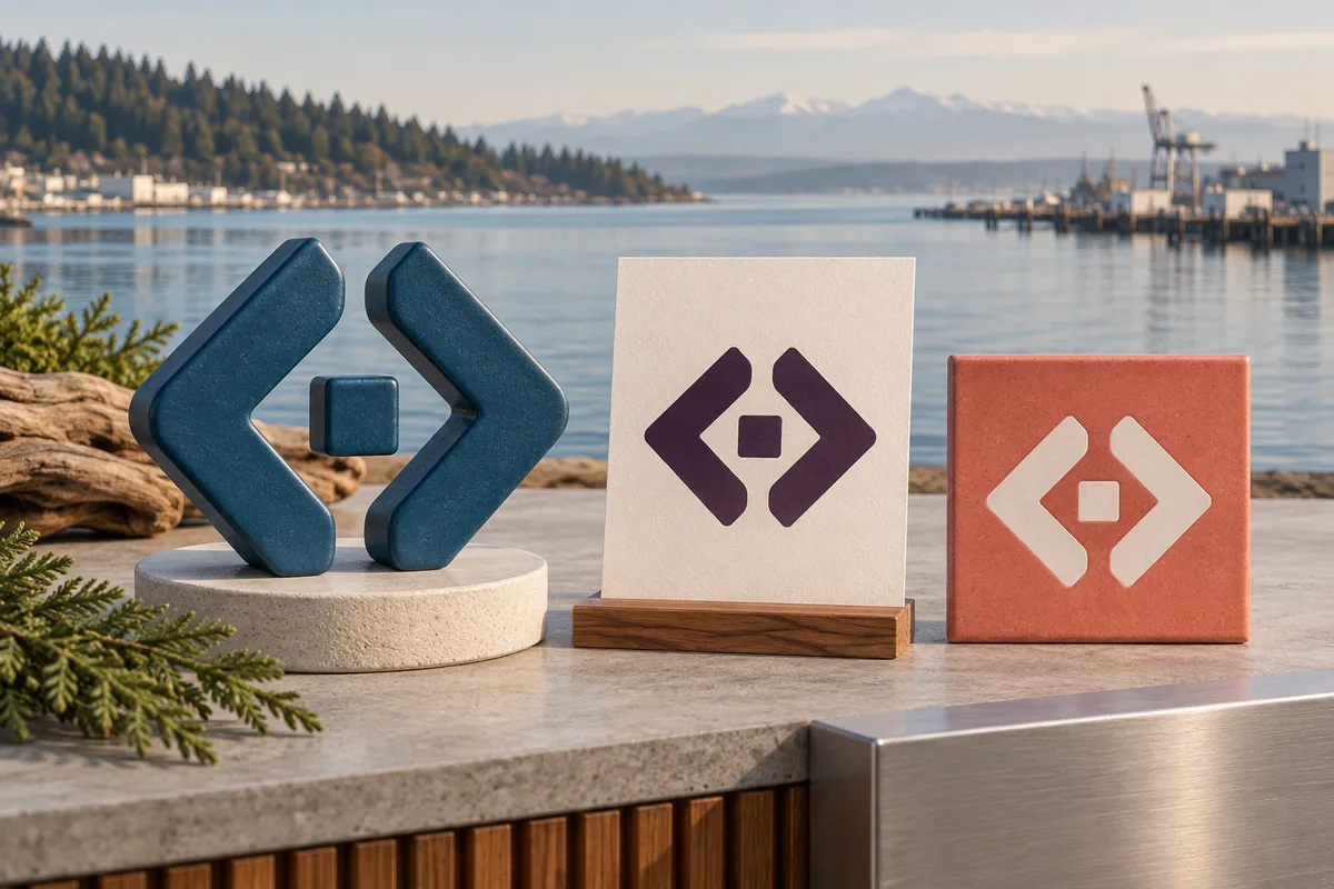
Give the business a clear visual signature
Logo design for Everett businesses with specialized work to represent
Galactic Digital Studios creates and refines logos for businesses in and serving Everett, Washington. We help turn the business name and intended character into an identity that customers can recognize across websites, documents, and everyday applications. The mark should introduce the company clearly without trying to explain its entire service list.
Everett's economic development plan describes a mix of manufacturing, maritime, healthcare, and retail activity. That variety is a reason to develop an identity around your particular business rather than assume every local company needs an industrial or nautical symbol.
We begin with the audience, the offer, and the uses that matter. Those decisions give the design a purpose beyond looking different from the previous version.
Decide what belongs in the mark and what belongs in the message
What should the logo communicate at a glance?
A name people can identify
Readable lettering helps someone connect an unfamiliar business with the recommendation, document, or website in front of them. A symbol should support that recognition rather than compete with it.
A suitable business character
Shape, typography, and color can suggest an appropriate tone. The identity should fit the audience and offer without relying on stock imagery or a collection of generic industry icons.
A consistent point of reference
The logo needs to remain recognizable across different layouts. Plan variations for important uses so the team can adapt the identity without recreating it from scratch.
A specialized business does not need a complicated emblem
A company may provide several related services, but the logo does not need a separate picture for each one. A clear name treatment and a focused visual idea can provide continuity while surrounding content explains the capabilities in detail.
For a hypothetical Everett technical service business, a simple wordmark could remain useful as the service range expands. A supplier might need a compact symbol for a small digital placement and a fuller arrangement for documents. These are possible briefs, not claims about Galactic's local commissions.
We consider the relationship between the identity elements at realistic sizes. A fine line or intricate detail may disappear in a small header or one-color application. Appropriate variations can solve those problems while preserving a coherent silhouette and name treatment.
If you already have recognition, review what customers associate with the business. A particular arrangement, shape, or color may be worth retaining. Distinguish a weak concept from an otherwise useful logo that simply lacks good source files or consistent usage.

Evaluate the identity against the business brief
Our approach balances distinction with practical use
We discuss the name, audience, services, current materials, and intended impression. We identify the applications that matter first and any constraints that affect them. That creates a shared basis for reviewing concepts instead of choosing solely by personal preference.
We explore typography, proportion, negative space, and color as parts of one system. A direction should work as plain artwork, not only as a large dimensional mockup. We refine the selected approach and check the agreed variations in representative uses.
A consistent identity supports branding and credibility as people encounter the business in different settings. It can help someone recognize the provider they researched earlier and feel confident they have reached the right company. Clear service content, distribution, and follow-up still do the work of supporting search visibility and leads.
For long-term growth, we consider whether the concept represents the business broadly enough to remain useful. The goal is a dependable foundation for future website and graphic design work, with guidance that helps others apply the identity consistently.

Define a usable identity system, not just a final picture
List where the logo needs to appear and what your team struggles with now. Website headers, business documents, small profiles, and physical materials may need different proportions or color treatments. Gather supplier requirements for specialized production early.
Discuss the primary arrangement, alternate versions, one-color artwork, and usage guidance. Confirm the source files and exports included in delivery. The file package should match the actual applications and make it clear which version belongs where.
Clarify concept review, revisions, final approval, and the rights attached to the completed work. Address any font or third-party asset permissions. Business-name and trademark review are separate responsibilities; a visual design approval does not establish legal clearance.
Budget and schedule depend on the extent of exploration, refinement, and application work. Coordinate Everett web development and graphic design when the identity will accompany a wider update. A planned transition helps customers recognize the same business across old and new materials.
Move from a clear purpose to consistent applications
How the Everett identity project can progress
Review the business and starting point
Gather the name, offer, current artwork, and intended uses. Identify the qualities to communicate and any familiar features worth preserving.
Develop relevant concepts
Explore directions that respond to the brief. Discuss how lettering, shape, and tone support the business before choosing a direction for refinement.
Refine and test the variations
Adjust proportions, spacing, and color. Review simple artwork and realistic applications so the identity remains clear outside a polished presentation.
Deliver files and application guidance
Prepare the agreed versions and explain their uses. Identify the first materials to update and any additional supplier preparation needed for specialized formats.
Look for an idea that belongs to the business
Portfolio selections on this page include TCA Transportation LLC, The Silver Guardian, Smokin’ Mage LLC, Bassmint Pros, and Sooo Good Lemonade. These existing Galactic identity projects show different approaches to connecting a name with visual character.
They are not presented as Everett commissions or as proof of a measured increase in recognition. Mockups illustrate applications rather than verified production or installation. Ask what the relevant design choices might mean for your brief.
Review the studio background and the proposed working process. Useful evidence includes a clear rationale, appropriate application checks, and a handoff that your team can understand.
Let local context inform the identity without overpowering it
The Port of Everett describes a waterfront combining seaport, marina, and property-development activity on Port Gardner Bay. That mix can offer visual context, but a regional reference should serve the business rather than become a default design requirement.
An anchor, aircraft, or mountain is not automatically the most useful way to represent an Everett company. Consider whether a less literal mark or a distinctive wordmark better expresses the offer. Let readable content explain services and coverage instead of asking a small symbol to carry every detail.
For related regional work, explore Silver Firs logo design. The Everett services overview connects the identity with a useful website and clear customer materials.

Everett logo design questions
Should the logo show every service we provide?
No. A focused identity can represent the broader business while surrounding text explains individual services. Trying to illustrate every capability can make the mark difficult to read and use.
Can we keep our existing business name and refresh the design?
Yes. Review recognition and practical problems first. A refresh can improve the execution while preserving useful elements that customers already associate with the business.
Do we need an industry symbol?
Not necessarily. A wordmark or abstract concept may fit the offer better. Choose the direction based on meaning, distinction, and usability rather than the most familiar icon in the category.
How do we keep the logo consistent across suppliers?
Provide an approved file set and clear usage guidance. Specify the appropriate versions and avoid asking each supplier to recreate artwork from a screenshot or an unsuitable export.
Can the identity support future services?
Yes, when the brief considers the business's broader direction. Avoid narrowing the concept unnecessarily, and keep changing service details in the surrounding materials rather than inside the logo.
Make the business recognizable for the right reasons
Build an Everett identity with a clear idea behind it.
Bring your business name, current artwork, and the applications that matter most. We can develop a practical identity that represents your expertise and gives future communications a consistent starting point.
Plan your Everett logo