

Design for the place where the explanation happens
The City of Kent describes a mix of retail, wholesaling, manufacturing, warehousing, and residential activity. Those settings create different communication tasks. A retailer might need a compact product card; a service team might need a preparation guide; a supplier might need a clear capabilities sheet. These are examples of possible uses, not claims about local demand or Galactic clients.
Graphic design becomes valuable when it reduces the work a customer must do to understand a choice. Hierarchy, readable type, and an appropriate amount of detail can make a sales conversation more consistent. We start by asking where the piece will appear and what someone needs to know afterward.
Galactic Digital Studios develops coordinated print and digital materials for small businesses. The specific deliverables follow the audience and the job the piece must do, whether it is handed across a counter, sent after an inquiry, or shared on a screen.
Choose a format that matches the decision
A one-page service comparison can help customers see differences quickly. A longer guide can explain preparation, exclusions, and next steps. A presentation may need a deliberate sequence from problem to capability to evidence. The right format depends on reading context and how much information is needed for a responsible decision.
Before designing, identify the single action the piece should support. Is the reader meant to choose a service, request a quote, prepare for an appointment, or remember a brand? More graphics will not fix conflicting messages. We clarify the content, then use visual structure to make it easier to use.
When a printed piece points to a website, the terms should align. Kent web development can provide a reliable destination for fuller answers; the graphic can make the first explanation faster.
Bring the practical details into the design brief
Tell us who receives the piece, its physical or digital setting, the next action, and the facts that cannot be misstated. Include dimensions, print quantity if known, distribution method, accessibility needs, and the deadline that actually matters. Supply current brand assets and examples of materials that cause confusion.
A proposal should state the number and type of deliverables, content responsibilities, review stages, production-ready formats, and editable-file expectations. Printing, photography, copy development, and many-size adaptations may be separate scope items. Cost and timing depend on those decisions and on how quickly the business can approve accurate information.
For a hypothetical Kent supplier, a capabilities sheet might need room for specifications and a qualification note. For a hypothetical shop, a card might need a simple product distinction and a direct path to purchase. Both examples require real business facts before design begins.
Make the message coherent across every application
We plan hierarchy before decoration: what should be seen first, which details support the decision, and where the reader goes next. Typography, contrast, spacing, and imagery should work together to make the material readable. A beautiful piece that buries a limitation or deadline is not doing its job.
Existing brand elements can guide the system when they are usable. If the mark or visual rules break down across sizes, Kent logo design may need attention before a full set of materials is produced. That sequence helps avoid reworking every graphic later.
Consistent materials can improve recognition and support a professional impression. They cannot by themselves guarantee sales. Offer quality, availability, pricing, distribution, and follow-up all contribute to outcomes. We focus on the part design can directly improve: understandable, credible communication.

Let’s identify the Kent customer question a better graphic could answer in one clear glance.
Develop, review, and deliver for the intended use
Discovery gathers source content and actual use cases. Direction explores how the information should be organized and what visual approach supports the brand. Creation develops the agreed materials, using realistic copy and imagery. Review checks factual accuracy, legibility, and whether the next step is clear.
Before delivery, confirm sizes, color and export requirements, and whether vendors need particular files. A screen graphic and a printed brochure may need different preparation. We can specify the handoff in the project scope; the business confirms any regulated statements, prices, policies, and production quantities.
Future changes matter. If services or terms change often, ask for a format your team can update or a clear arrangement for revisions. A reusable system is more valuable than a one-time asset that quickly becomes inaccurate.
What selected work can and cannot demonstrate
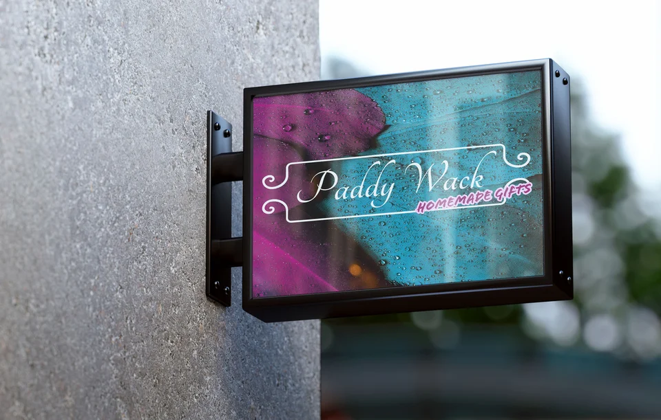
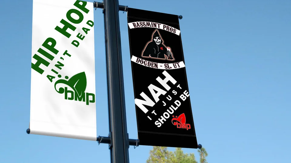
Our portfolio includes graphic applications for Paddy Wack Homemade Gifts and Bassmint Pros, alongside identity work for Sooo Good Lemonade and The Silver Guardian. These examples show approaches to hierarchy and visual consistency. They are not Kent commissions, confirmed installations, or evidence of measured sales improvements.
Mockups show how a design may look in context. Ask what source files, production specifications, and usage rights would be delivered for your own project. The studio background provides more context about Galactic; the decision should still rest on a scope that fits your materials.
For businesses operating around South King County, the Auburn and Federal Way pages provide related service context. Your own graphics should state genuine service coverage and avoid implying a local office where none exists.
Design for the handoff after the first conversation
Many useful graphics are seen after someone has already asked a question. A follow-up PDF can recap options; a preparation card can reduce uncertainty before service; a simple comparison can help a team explain choices consistently. Choose the moment where clarity would help most.
When the business changes, check every place the old claim appears. The website, print file, and social graphic may all need an update. Building a small source-of-truth list for prices, terms, and service names can make that maintenance easier.
Design should help the business thrive by making its real offer easier to understand and remember. The strongest brief is specific about audience, task, constraints, and how the finished material will be used.

Questions about graphic design in Kent
What graphic materials should we start with?
Choose the piece that answers a recurring customer question or supports a real sales step. Its format should follow where and how people will use it.
Can you work with our current logo?
Often, yes. We first check whether the available files and variations work at the needed sizes. If they do not, an identity update may be sensible.
Do we receive print-ready files?
The file types and production specifications should be agreed in the scope. Share vendor requirements early so the artwork can be prepared for the intended use.
Who writes the copy?
That depends on the project scope. The business should always review and approve factual claims, prices, policies, and service terms before production.
Can graphics match our website?
Yes. Shared type, color, imagery, and wording can make the experience consistent. Each format still needs its own layout and accessibility considerations.
Ready for a more useful next step?
Give every important customer touchpoint a clearer purpose.
Tell us what customers need to understand and where your current materials fall short. We can discuss a focused scope for your Kent business and explain what information the project needs.
Discuss your Kent project