

Design for where people meet the business
Pierce County’s community plan describes connected neighborhoods, lakes, recreation, and major commercial arterials around Spanaway. A business may be encountered at a counter, on a phone, during an estimate, or through an event piece. Those settings have different reading distances and information needs.
A hypothetical provider may leave a sheet after visiting a home. A retailer may need a window notice and matching social graphic. An instructor may need an easily updated schedule. These are examples for planning, not claims about local Galactic clients or proof that any one format will perform best.
Galactic Digital Studios designs around the reader’s task. A lake or mountain image can provide atmosphere, but it should not hide the offer, service boundary, or next step. Local context helps us ask where a piece will be used and what a customer needs to understand there.
Choose one primary job for each piece
A poster can announce, a service sheet can explain, and a social graphic can draw attention to a current offer. Trying to make one file do all of those jobs often leaves the main message unclear. Name the reader and the desired action before choosing visual style.
Write and approve the essential facts: service name, date, price if relevant, conditions, location, and contact path. Printed errors may be costly to correct. If details change frequently, consider a reusable layout or direct readers to a current website page with the full explanation.
Keep the graphic and destination aligned. A short digital piece should not advertise an offer that the linked page cannot explain. A printed handout should use the same service name staff use in conversation. Consistent wording reduces avoidable questions and supports trust.

Plan every size before producing files
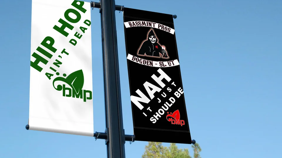
A phone screen, counter card, service sheet, and sign are not interchangeable surfaces. The amount of text, type size, crop, and contrast should match how quickly and from how far someone will read. A large presentation mockup can conceal problems that become obvious in the final format.
Print production may require bleed, safe margins, color preparation, and coordination with a vendor. Digital uses may require different aspect ratios and light file sizes. Ask the printer or platform for specifications before final approval. A useful proposal names the actual exports rather than simply saying “print and digital.”
On websites and email, essential words should remain in accessible HTML near the graphic. Alt text can describe meaningful imagery, but it should not be the sole source of a date or eligibility rule. This also makes important details easier to update.

Set hierarchy before decoration
Galactic starts with purpose, audience, and any existing identity rules. We decide what people must see first, what detail supports that message, and what action comes next. Typography, color, imagery, and spacing then reinforce the order instead of competing for attention.
If the current mark works, it can be used across a focused group of pieces. If it is inconsistent or unreadable, Spanaway logo design may help establish a more reliable base. A single flyer does not automatically require a broad rebrand; scope should follow the actual problem.
Repeatable materials benefit from a simple system: approved type, colors, mark placement, and message hierarchy. A one-time campaign may instead need a carefully finished production file. The handoff should fit who will maintain or reuse the design.

Specify applications, reviews, and rights
A number of files does not describe the work. A detailed infographic can require more planning than several related cards. Ask whether copy development, image selection, illustration, alternate sizes, and production coordination are included. Compare the finished outputs, not only the initial mockups.
Provide approved copy, current brand files, photos with usable rights, dimensions, vendor requirements, and a person who can confirm facts. If several stakeholders review, have one person consolidate feedback. Late changes to an offer or date can affect every planned format.
Clarify editable files, exports, fonts, licenses, and future uses. A mockup is not the same as a print-ready file or reusable template. The agreement should state what the owner receives and how those materials may be used.
Review the design at its actual size
Discovery establishes the audience, message, channel, and next step. An initial direction tests hierarchy using real content. Feedback should identify what a reader misses or misunderstands. Once the message works, refinement can improve visual tone and consistency.
Before delivery, inspect the piece in each intended format. Can a phone user read the main point? Does a print proof preserve margins and contrast? Does a link or QR destination deliver the information promised? The finished piece should be judged in context, not only enlarged on a monitor.
At handoff, confirm approved exports, any agreed source files, and instructions for repeat use. If staff will update a template, identify which parts can change safely. A useful design system helps the business communicate accurately after the initial piece is finished.

Use portfolio work to sharpen the brief
Galactic’s graphic portfolio shows completed work for businesses elsewhere. It is not evidence of Spanaway commissions or measured campaign results. Review how each example makes a message visible and whether it remains clear at smaller sizes.
Bring your existing signs, posts, flyers, and service sheets. They can reveal conflicting names, outdated details, or unrelated styles. A brief grounded in those materials is more useful than copying a portfolio style that belongs to a different audience.
Clearer graphics can support recognition and informed inquiries. They cannot guarantee response. Distribution, timing, price, offer quality, and follow-up all affect outcomes. First judge whether the design communicates its intended message in the place it will be used.
Questions about graphic design in Spanaway
Can one layout work for print and social media?
The concept may carry across, but different sizes and reading conditions often call for separate layouts.
What should a brief include?
Provide audience, purpose, approved copy, brand files, photos, dimensions, production details, and an approval contact.
Can an existing graphic be improved?
Yes, when rights and source files allow it. First identify whether the issue is message, format, or hierarchy.
Will I receive editable files?
That depends on scope. Confirm editable files, exports, licensing, and future use before work begins.
Is a new logo required first?
Only if the current identity cannot support the planned materials. Many focused graphic projects can use a workable existing mark.
Ready for a useful next step?
Give the next piece a clear job to do.
Share the message, audience, and viewing setting. We can discuss a useful graphic design scope for your Spanaway business.
Discuss your Spanaway project