
Design for how the material will be used
Layton's town-center planning focuses on neighborhood access to goods and services. A graphic handed across a counter has a different job from a PDF sent after a detailed inquiry. The reader’s context should shape the amount of text, format, and next step.
A hypothetical local service team might use a preparation card. A hypothetical shop could use a product comparison. A hypothetical business supplier might need a capabilities sheet. These are examples of possible communication tasks, not Layton clients or measured local demand.
Galactic Digital Studios develops graphic materials that make an offer easier to understand in print and digital settings. A useful piece answers a real question rather than simply filling a visual space.
Choose one task for the first piece
A comparison guide can show differences between options. A preparation sheet can help someone arrive ready. A presentation can explain capability and process. A small card can remind a person how to take the next step. These formats carry different amounts of detail and should not be treated as interchangeable.
Ask what the reader should know or do after seeing the piece. If details change frequently, point to a maintained Layton website for current information. Do not print a price, schedule, or term that the business cannot keep accurate.
Hierarchy matters: the main decision should be obvious, qualifications should sit near the claim they modify, and small print should not carry the only important instruction. Visual polish should support understanding.
Bring content and production details to the brief
Provide the audience, distribution setting, dimensions, deadline, approved facts, brand files, and any printer or platform specifications. Identify who can approve pricing, eligibility, and service terms. That source information helps design begin with reality rather than placeholders.
Compare proposals by deliverables, review stages, content responsibilities, editable files, and production-ready exports. Printing, photography, copy development, and extra size adaptations may change scope. Cost and timing follow those requirements and feedback speed.
If the material needs regular updates, agree on how changes will be made. A reusable format or clear revision process can be more valuable than a one-time design that becomes inaccurate quickly.

Make separate pieces feel like one business
We organize the message first, then apply typography, contrast, spacing, and imagery to direct attention. The work should remain readable in its intended size. A print preview, phone screen, and presentation slide each need a different check.
An existing identity can guide the system if its files and rules are usable. If the mark fails at small sizes or varies wildly across applications, Layton logo design may need attention before a large collateral set is produced. That choice follows the materials, not an automatic package.
Coordinated graphics can support recognition and a professional impression. They do not guarantee sales. Offer quality, distribution, price, and follow-up still matter; design improves the clarity and consistency of what people see.

Let’s turn one repeated Layton customer explanation into a graphic your team can use.
Plan beyond the attractive mockup
A take-home guide may need a printable file and an accessible digital version. A presentation may need editable diagrams. A social image may need accompanying text because essential words embedded in a picture are hard to access and update.
Test the smallest and largest uses. A headline that works in a large layout can disappear on a phone. A detailed comparison that works on screen may be cramped in print. Each application needs a layout that respects reading distance and context.
Mockups help review direction but do not prove a piece was printed or installed. Final files should be checked against the actual vendor or platform requirements.
If a piece will be shared by different staff members, make the source and instructions easy to find. Agree on which fields can change and which design elements should stay consistent. This avoids a collection of slightly different versions that leave customers unsure which one is current.
From clear brief to usable files
Discovery gathers source information and identifies the reader’s task. Direction tests hierarchy and visual treatment. Creation builds the agreed pieces. Feedback checks accuracy, legibility, and whether the next step is clear. Delivery provides the specified formats and guidance.
The business confirms factual statements and rights to supplied imagery. If a piece references availability, policy, or price, review it before release and assign someone to keep it current.
Timing depends on the number of applications, production requirements, and the readiness of content and reviewers. A realistic schedule leaves room for factual checks.
Use portfolio work to discuss the right details
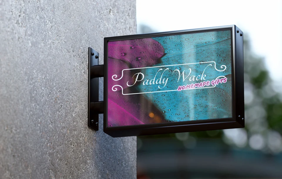
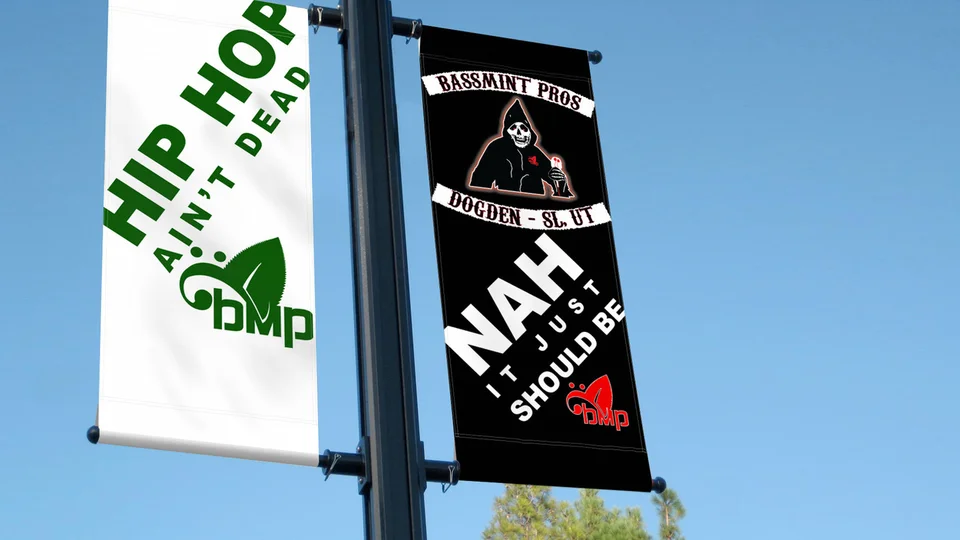
The Galactic portfolio includes Paddy Wack Homemade Gifts and Bassmint Pros graphic presentations, plus identity applications for Sooo Good Lemonade and The Silver Guardian. These are not Layton commissions or evidence of measured sales results. Some presentations are mockups rather than confirmed installations.
Ask whether the format, hierarchy, and tone would help your own audience. A neighborhood service guide and a detailed business proposal should not carry identical content. Our studio background provides additional context.
Businesses serving nearby communities can also review Bountiful and Ogden service pages. Geographic claims in your own material should match actual coverage.

Questions about graphic design in Layton
What graphic should we make first?
Choose the piece that answers a recurring question or supports a specific customer step. Its format should follow actual use.
Can you work with our existing logo?
Often, after checking file quality and legibility across the planned applications.
Will we receive print-ready files?
The proposal should name formats and production requirements. Share vendor specifications early.
Who approves the wording?
The business confirms service facts, prices, policies, and dates. Design can clarify those facts but cannot validate the promise behind them.
Can a piece work in print and digital?
A shared design system can connect them, while each format needs its own layout, dimensions, and accessibility review.
Ready for a useful next step?
Make your next customer explanation easier to follow.
Tell us what customers need to understand and where your current materials fall short. We can discuss a focused scope for your Layton business and the information needed to begin.
Discuss your Layton project