

Make the same business recognizable everywhere
Logo design for East Port Orchard businesses with room to grow
Galactic Digital Studios provides logo design for small businesses in and serving East Port Orchard, Washington. We help develop identities that introduce the business clearly and remain useful across websites, documents, work materials, and the places customers encounter your name. The goal is a consistent foundation your team can use with confidence.
East Port Orchard has its own identity within the wider South Kitsap area and appears in the Census Bureau's list of census-designated places. A local connection can be meaningful, while the visual identity still needs to represent your specific offer and audience.
We begin with what the business should be known for. That gives the project a clearer purpose than choosing a familiar symbol and adding the company name beneath it.
Identify the job the logo needs to do
Where does your current identity help or cause friction?
At the first introduction
The name and visual character should help someone identify the business and understand its tone. A symbol can support that introduction, but it should not make an unfamiliar name harder to read.
Across practical applications
A website header, service sheet, and small profile image have different constraints. Useful variations can adapt the identity while preserving the relationship between its main elements.
As the offer develops
Consider whether the current concept describes the business too narrowly. An identity tied to one task or product may become awkward if your services expand.
Build recognition through details your team can repeat
A business identity is encountered in pieces. A customer may see the logo on a website, receive a document later, and recognize it again on a printed card. Consistent use helps connect those moments without requiring every layout to be identical.
For a hypothetical East Port Orchard service provider, a clear wordmark might be the most useful element on a document, while a compact symbol fits a small digital placement. Another business might need a horizontal arrangement for work materials. These are possible requirements, not claims about Galactic's local projects.
Define the relationships that should stay consistent: proportions, spacing, color versions, and the treatment of the name. A practical identity system gives the team a way to choose the right file rather than recreate or stretch the logo to fit.
If the business already has recognition, review what is worth preserving. A refresh can address difficult lettering or inconsistent files while keeping familiar features. A new name or significantly different offer may justify a broader change.

Make the concept fit the business and the application
Our approach connects meaning with usable design decisions
We discuss the offer, audience, business name, and intended impression. We review existing materials and the applications that matter most. Those requirements help us evaluate concepts in terms of fit and clarity rather than personal taste alone.
Typography, shape, color, and balance work together to express the direction. We consider the identity as plain artwork and at realistic sizes. One-color versions and simpler arrangements can reveal practical weaknesses that a large mockup might hide.
A coherent identity supports branding and credibility as people compare providers and decide whether to inquire. It can help them recognize the business they discovered earlier, while clear website content explains the services behind the name. The logo does not create search visibility or leads by itself. It provides a consistent visual foundation for those efforts and for the communications the business will need as it grows.

Define the file set around your real uses
Explain whether you need a new logo, a refresh, or broader identity guidance. List the applications that matter first, including small digital placements and any specialized production. Supplier constraints should be considered before final approval.
Discuss the primary arrangement, alternate versions, color options, and supporting type direction. Clarify whether usage guidance or templates are included. A collection of exports is most useful when the team understands which version belongs in each setting.
Ask how concept review, revisions, and approval work. Confirm final artwork, agreed usage rights, and any font or third-party asset permissions. Responsibility for name and trademark review should be addressed separately from design approval; a visual concept is not legal clearance.
Budget and schedule depend on the amount of exploration, refinement, and application work. Coordinate East Port Orchard graphic design for service materials and web development when the new identity will accompany a revised site. Plan the first updates so the rollout feels connected.
Make clear decisions from brief to handoff
How the identity project can progress
Understand the starting point
Review your name, audience, current recognition, and applications. Identify the qualities the identity should communicate and any practical problems the project needs to solve.
Explore relevant directions
Develop concepts that respond to the brief. Discuss how the name, symbol, and tone work together. Choose a direction based on the business and its needs.
Refine and test the system
Adjust spacing, proportions, color, and arrangements. Review the agreed applications at realistic sizes and check the identity without presentation effects before finalizing it.
Deliver files and usage guidance
Prepare the agreed artwork and explain its uses. Identify the priority materials to update and provide the guidance needed to keep later applications recognizable.
Look for an identity that serves its subject
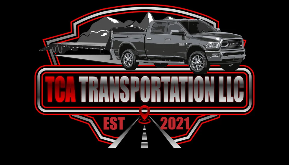
The examples on this page include TCA Transportation LLC, The Silver Guardian, Smokin’ Mage LLC, Sooo Good Lemonade, and Bassmint Pros. They show different visual approaches to the relationship between a business name, a symbol, and an intended character.
These existing Galactic portfolio selections are not presented as East Port Orchard commissions. Mockups illustrate the artwork in a setting rather than verify production or prove a particular business result.
Review the studio background and ask how the relevant design decisions would apply to your requirements. A clear rationale, useful application checks, and a defined handoff make the proposed identity easier to evaluate.

Let local character support your own business story
The trails and recreation settings documented at South Kitsap Regional Park offer one part of the area's character. An outdoor reference may fit some businesses, while a different visual direction will better represent others.
Your identity does not need a tree, shoreline, or regional outline to belong here. Choose a concept that means something for the offer and remains understandable if the business serves a wider audience. Keep service-area explanations in readable website text rather than expecting the logo to carry them.
Explore related Port Orchard logo design for the surrounding market. The East Port Orchard services overview connects identity with a useful website and clear customer materials.

East Port Orchard logo design questions
Can a logo work for several related services?
Yes. Develop the identity around the broader business character and use clear service descriptions in the surrounding content. Avoid a concept that unnecessarily limits the offer to one narrow task.
Should we refresh our logo or start again?
Review existing recognition and the practical weaknesses first. A refresh may solve readability or consistency problems, while a changed name or business direction may call for a new concept.
How can we stop different versions appearing across our materials?
Keep an approved file set and provide clear usage guidance. Identify the right arrangement and color version for each application so the team does not need to improvise.
What files will suppliers need?
Collect requirements for your intended uses during planning. Discuss scalable artwork, screen exports, and suitable color versions, with any specialized production preparation identified separately.
Does the identity need to include East Port Orchard?
Only if the location has a useful role in the name or positioning. Consider readability and future coverage. The website and materials can communicate the service area clearly alongside the logo.
Give the business a consistent visual foundation
Build an East Port Orchard identity your team can use well.
Bring your name, your current files, and the applications that matter most. We can develop a recognizable direction that fits your services and supports the next stage of your business.
Discuss your East Port Orchard logo