
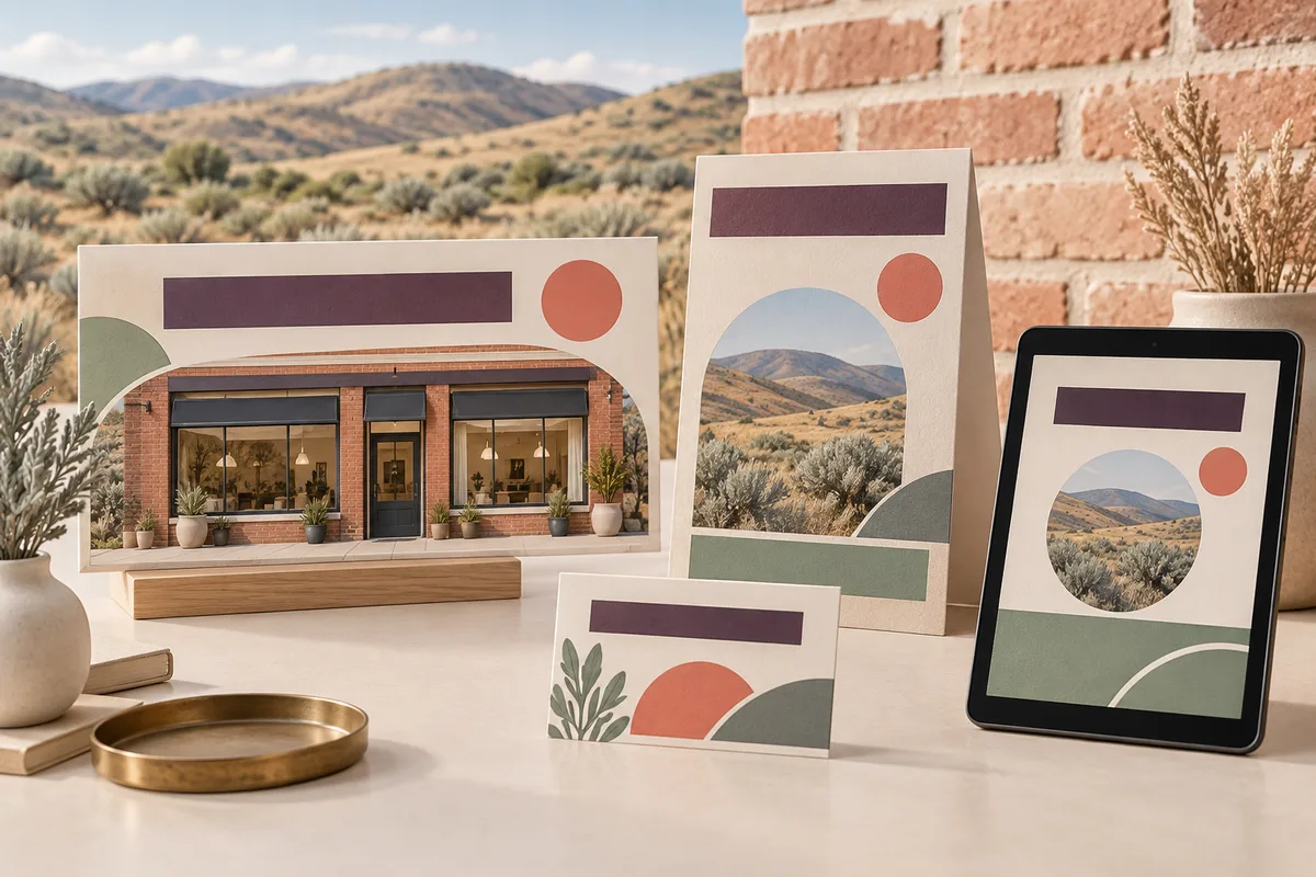
One offer, clearly expressed in different places
Graphic design for Evanston storefronts, services, and local promotions
Galactic Digital Studios provides graphic design for businesses in and serving Evanston, Wyoming. We create materials that make the offer readable, recognizable, and useful in the setting where a customer sees it. A window message, counter card, and digital announcement have different jobs, even when they support the same service.
Evanston's Main Street program connects downtown revitalization with promotion, design, and business improvement. That local emphasis makes coordinated business communication a relevant topic, while the right design still depends on your own audience and offer.
We help decide what belongs on each piece and what should stay consistent across the set. The goal is to make your business easier to understand without asking every layout to carry every detail.
Design for the actual reading situation
What can someone reasonably absorb from this piece?
At a glance
A window message or broad display needs a clear focal point. Establish the service or offer first and avoid crowding the space with information that requires close reading.
During a conversation
A counter display or service sheet can answer the next question. Organize the details so your team can refer to them naturally and the customer can compare relevant choices.
When they return to it later
A take-away card or digital piece needs enough context to stand on its own. The reader should recognize the business, understand the purpose, and know where to continue.
Adapt the message instead of shrinking the same artwork
A layout that works in a window may become unreadable when reduced to a small social image. A detailed service sheet may overwhelm a compact card. Reusing the identity is useful; forcing identical content and proportions into every format usually makes the message harder to follow.
We can develop a coordinated set with a shared visual language and different information levels. Typography, color, imagery, and a few repeatable layout choices create continuity. The most prominent message changes according to the piece's purpose.
For a hypothetical Evanston shop introducing a service, the window piece could announce it, the counter card could explain how it works, and the website could provide the full details. A local professional could use the same principle across an introduction sheet and a digital summary. These are possible applications, not claimed client work.
Agree on the source wording before extending the design. Offer details, dates, exclusions, and next steps should match across formats. A customer should not have to resolve conflicting information between a printed piece and the page it leads to.
Make the hierarchy serve the message
Our approach starts with purpose, distance, and attention
We ask where the design will appear, how someone will encounter it, and which action it should support. We review the amount of content and the available space before settling the layout. That helps identify whether you need one piece or a small coordinated set.
We use contrast, spacing, type scale, and image selection to guide attention. Important information should remain legible at the intended size. When several services or options appear together, consistent labels and grouping help the reader understand the differences.
Brand consistency supports recognition, while careful presentation can strengthen credibility during a purchase or inquiry decision. Useful materials can carry a lead from initial interest to a fuller explanation. Reusable design patterns also give the business a practical way to extend communications over time.
For online discovery, graphics work best alongside readable service content. Keep essential explanations available as website text rather than only inside an image. Visual design supports the experience, but it does not independently guarantee search visibility, AI citations, or sales.

Define the formats and the facts before production
List the materials, dimensions, intended uses, and delivery requirements. If a supplier will print or fabricate the work, obtain its specifications early. A design-ready concept and a file prepared for a particular production method are different stages.
Bring approved wording, identity files, and images you can use. Identify who verifies service details and who provides final approval. When several people contribute feedback, a single consolidated response helps avoid contradictory changes.
Discuss editable templates if the information will change regularly. They need to fit the tools and skills of the person making updates. Clarify which changes the template is intended to support and when a new layout or design review will be needed.
Cost and timing depend on content preparation, format count, complexity, and revision scope. Printing, installation, and specialized production should be explicitly addressed rather than assumed. Coordinate Evanston logo design for identity changes and web development for the pages that complete the message.
From a clear brief to coordinated files
How the graphic design work can progress
Establish the message and uses
Review the audience, offer, placement, and next action. Confirm the required information, available assets, and output requirements before developing the visual direction.
Design a representative piece
Use actual content to test the hierarchy and character. Review it at the intended proportions so a large presentation does not hide small-format readability problems.
Adapt the direction across formats
Develop the agreed pieces with consistent identity and appropriate content levels. Check that service details and calls to action remain aligned across the set.
Check and deliver the artwork
Prepare the agreed files and review output specifications. Provide relevant usage or template guidance so the team understands which version belongs in each setting.
Look at how the message changes with the medium
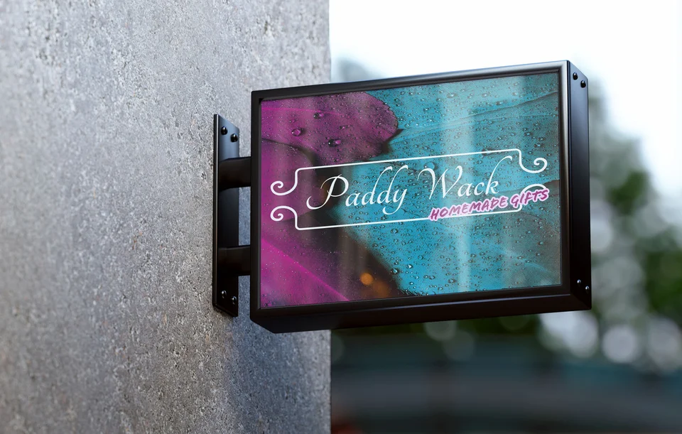
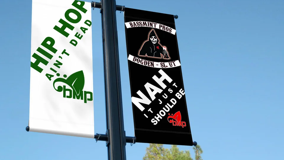
Portfolio examples include PaddyWack Homemade Gifts signage, Bassmint Pros graphics, an environmental campaign billboard presentation, and identities for Sooo Good Lemonade and TCA Transportation LLC. They provide different contexts for discussing scale, contrast, and visual character.
These existing Galactic selections are not Evanston commissions or evidence that a complete campaign set was produced for each business. Mockups demonstrate applications rather than verified installations or measured results.
The studio background and a clear explanation of the proposed work help establish fit. Ask how the design will remain readable and useful in your actual delivery setting, not only in a presentation.

Connect local character with accurate business information
Evanston's historic Roundhouse and Railyards reflects the city's railroad heritage and serves as a public event setting. That context may inform an event-related brief or a visual mood, but it does not establish a business's affiliation with the venue.
Use place references, event names, and local imagery only when they relate to the offer and can be represented accurately. For a changing promotion, decide who replaces old materials when the information expires. Clear communication includes knowing when a piece has finished its job.
If your materials also reach Utah customers, explore Park City graphic design. Return to the Evanston services overview to plan graphics alongside the rest of your business presentation.
Evanston graphic design questions
Can one promotion have several coordinated formats?
Yes. Establish a shared message and identity, then adapt the amount of information and layout to each setting. A window display and a phone-sized graphic should not simply be identical resizes.
Can you design around our existing logo?
Yes, when suitable files are available and the identity still fits the business. Consistent typography, colors, and layouts can improve the materials without requiring a new mark.
Does graphic design include printing or installation?
Those responsibilities should be specified in the proposal. Confirm supplier requirements, production coordination, and any separate costs before assuming they are part of the design scope.
How do we make recurring announcements easier to update?
Use an agreed content structure and a template suited to your tools. Define which elements can change and who checks the details before each new version is published.
What if we have too much content for the format?
Prioritize the information needed at that moment and move supporting detail to an appropriate second piece or page. Shrinking all the text usually makes the material less useful.
Give the message a form people can use
Make your Evanston graphics clearer from the first glance.
Bring the offer, the formats, and the places the material will appear. We can build a coordinated design direction that helps customers understand the business and take the next step.
Plan your Evanston graphics