

Designed to be understood
Graphic design for the way Seattle businesses communicate
Galactic Digital Studios offers graphic design for businesses in Seattle, Washington, connecting clear messages with visuals that work in the places customers encounter them. That could mean a sign, a campaign graphic, a business card, or a set of supporting website assets. The goal is to make your offer recognizable and easier to understand, not simply to add decoration.
Seattle’s creative economy includes film, music, and other creative occupations. Its neighborhood business districts also bring many different businesses into close visual proximity. That makes context important. A hypothetical music event in Capitol Hill needs different communication from a marine service company presenting capabilities to a commercial buyer. A bold visual can earn attention, but the information still needs to be organized for the person reading it.
We work remotely with Seattle businesses and use your knowledge of your customers to shape the brief. Tell us where the work will appear, what someone should notice first, and what you want them to do next. Those answers guide better choices than starting with a preferred color alone.

One message may need several different designs
Digital graphics
A graphic in a social feed has to communicate at a small size. Website banners need to coexist with navigation and real page text. Plan for the actual placement instead of assuming that one large image can be cropped into every format without losing meaning.
Print and physical materials
Business cards, signs, and other printed pieces involve dimensions, viewing distance, materials, and production requirements. Confirm the printer’s specifications before final preparation. An appealing screen preview is not the same as a production-ready file.
Connected sets of assets
A coordinated group of pieces can share typography, color, and hierarchy while adapting to its purpose. Consistency helps customers recognize the business; variation lets each message work in its own setting rather than becoming a repetitive template.
What to establish before a design project begins
Start with the content, audience, and intended use. A clear brief might describe a seasonal offer, the customer it is for, the formats needed, and a production deadline. If the copy is still changing, say so. Late text changes can affect the composition, and a missing product photograph may be more important to the schedule than the design itself.
Gather existing brand files, approved colors, fonts, photography, and any rules the design must follow. If these are incomplete, we can discuss whether the project is a specific graphic assignment or whether the identity needs attention first. That distinction helps avoid paying for work that will be replaced soon after.
When comparing quotes, ask about the number of distinct concepts, adaptations, review rounds, final formats, and source-file arrangements. Confirm whether copywriting, image sourcing, and printer coordination are included. A “banner” might mean one static asset or several layouts with different messages; the scope should make that clear.
The thinking behind the image
Visual hierarchy should serve the message
Our strategic approach begins with the information the customer needs most. We work out the relationship between the main message, supporting detail, brand identity, and next step. Color, type, scale, and spacing then help guide attention. A graphic that attracts a glance but hides the offer has only done part of its job.
For a Seattle neighborhood business, that might mean keeping an event date readable on a small screen or making the business name recognizable from the sidewalk. These are examples of design problems, not claims about projects we have completed in those neighborhoods. Your actual use case determines the priorities.
Good graphic design can support visibility, credibility, and repeat recognition. It can also make a campaign or sales conversation easier to follow. Lead generation still depends on the offer, audience, distribution, and follow-through. We discuss what the artwork is meant to accomplish without presenting a new visual as a guaranteed growth result.
Make images work with your website’s information
Graphics can clarify a message, but important service information should also be available as page text. Someone should not need to read a tiny image to learn what you offer. When artwork supports a website, we consider its role alongside headings, body copy, links, and image descriptions.
That approach supports people using different devices and ways of accessing content. It also avoids treating a visually polished graphic as a substitute for an informative page. Useful visual assets and clear written explanations belong together.
If the design is part of a broader site update, explore our Seattle web development services. If the mark, colors, or visual direction are not yet settled, our Seattle logo design page explains the identity decisions that may need to come first.
From brief to finished files
A process that accounts for the final application
Clarify the assignment
Define the message, audience, placements, quantity of assets, and deadlines. Review the material you already have and identify missing content or production specifications. Agree on who can approve the work.
Develop a visual direction
Build the composition around the message and existing identity. Discuss why the design emphasizes certain information. A useful review asks whether a customer will understand the offer, not only whether everyone shares the same personal taste.
Refine and adapt
Use feedback to improve clarity, then adapt the approved direction to the agreed formats. A square social graphic and a wide sign may need different arrangements to preserve the same hierarchy.
Prepare for delivery
Review spelling, dimensions, image quality, and required file types. Confirm the intended use of each output and any external production requirements. New sizes, additional campaigns, or future changes can be discussed separately.
Look at how the work behaves in context
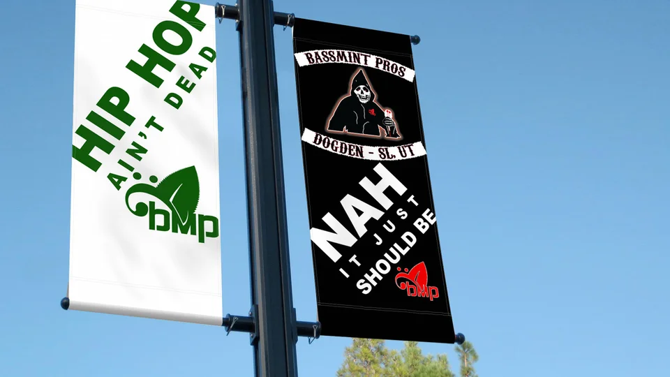
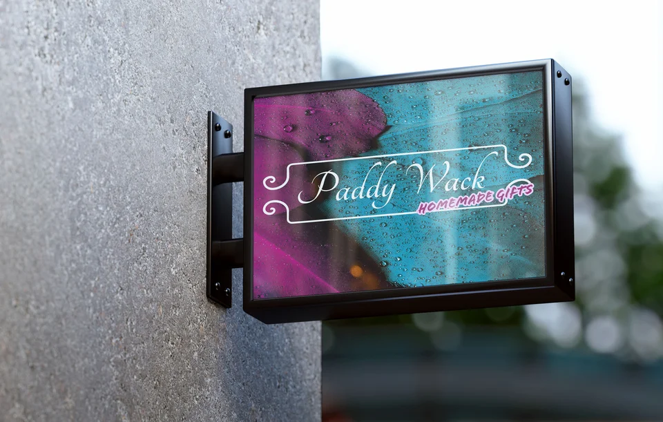
The portfolio examples shown here include a campaign billboard, Bassmint Pros street banners, and a Paddy Wack Homemade Gifts sign mockup. The accompanying identity examples illustrate other visual styles in the studio’s work. These are portfolio selections, not a list of Seattle clients, and presentation mockups do not establish that a piece was physically installed.
Look for decisions you can inspect: what is read first, whether the business name is legible, how the palette supports the subject, and whether the visual feels appropriate for its setting. Those observations create a more useful conversation than a vague request to make something “pop.”
Galactic’s background combines web development with logo and graphic design. Explore the full portfolio to compare examples, and tell us which kinds of application matter for your own business. We can then discuss the relevant scope without promising that an unrelated example predicts your results.

Stay consistent as your audience expands
A business serving Seattle and nearby cities may need to adapt information while preserving a recognizable identity. Different event details, service availability, or campaign offers do not require an entirely new visual language every time. Establishing a flexible system makes future updates easier to plan.
For related service areas, see graphic design in Bellevue and graphic design in Renton. Our Seattle services overview explains how graphic design connects with the rest of a business’s presence.
Bring the actual local details your audience needs. Accurate names, approved translations where relevant, and clear event or offer information are more valuable than adding a landmark that has little to do with the message. The design should help your business participate in its community with clarity.

Seattle graphic design questions
Can you use our existing logo and brand colors?
Yes, existing brand materials can guide the project. Share original files and any usage guidelines. If an asset is too small or incomplete for the intended application, we should identify that early and discuss how to address it.
Is printing included with graphic design?
Do not assume printing is included. Design, file preparation, and physical production are separate responsibilities that need to be agreed. Share your printer’s requirements and deadline so the design can be prepared for the intended process.
Can one design be used for social media and a sign?
A shared direction can be adapted, but different shapes and viewing distances often need different layouts. Define the required versions at the start so the scope includes the adaptations you actually need.
What files will we receive?
The delivery formats should match the approved scope and intended uses. Discuss screen files, print files, and editable source files before work begins, including any font or image licensing limitations that affect future editing.
How do we give useful design feedback?
Describe the communication problem: a headline feels secondary, the offer is unclear, or an image does not fit the audience. Consolidate feedback through the agreed reviewer so revisions can address a clear direction.
Make the message count
Give your next idea a clear visual direction.
You might need a single important piece or a family of graphics that works together. Start with the message, the audience, and where the work will appear. We’ll help shape a design project that makes sense for your Seattle business.
Discuss your design project