
Give the offer a clear, consistent introduction
Graphic design for Des Moines business promotions and service materials
Galactic Digital Studios provides graphic design for small businesses in Des Moines, Washington. We create materials that help people notice an offer, understand the useful details, and know what to do next. That includes planning how a message carries across print, digital graphics, and the website behind them.
The City of Des Moines describes dining and shopping around its recreational marina. For a business communicating in that setting, a counter display, takeaway leaflet, or digital announcement can introduce the offer at different moments in a customer's visit.
The same principles apply to everyday services elsewhere in the city. Start with a useful message, give it a readable order, and choose a format that suits the setting. We help keep the business recognizable while each piece does its own job.
Decide what the material needs to communicate
What should someone notice, understand, and do?
The offer
Lead with the specific product, service, or announcement. A reader should understand why the piece is relevant before working through supporting details or a long introduction to the business.
The important conditions
Keep the details that affect the decision readable and close to the message. Dates, availability, or eligibility should not become an afterthought that changes the meaning of the headline.
The destination
Give the next step enough context. If someone follows a link or scans a code, the destination should continue the offer they just read rather than leave them searching for it.
Build a coordinated set without shrinking one layout everywhere
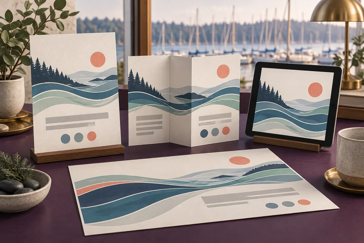
A counter card, wide announcement, folded leaflet, and social graphic have different reading conditions. A person standing nearby may scan a few words, while someone holding a leaflet can explore more detail. The layouts should reflect those differences.
For a hypothetical Des Moines retailer, a short announcement might introduce an offer and point to a more complete online explanation. A service provider could use a leaflet to distinguish options, with a simpler digital graphic inviting people to learn more. These are possible applications rather than claimed local projects.
Keep the central message and important conditions consistent across versions. Then adapt the hierarchy, content length, and imagery to each placement. A campaign can look connected without forcing a dense printed layout into a small screen.
Consider what happens after the announcement ends. Decide which pieces need replacing and whether the linked page should explain that the offer has finished. A reusable design system is most useful when the information behind it has an owner.

Make attention lead to understanding
Our approach connects message, format, and follow-through
We begin with the audience and the action you want the material to support. We identify the essential information, the supporting explanation, and any details that change between versions. That gives the design a purpose before typography and imagery are chosen.
Color, spacing, contrast, and composition then establish a clear reading order. The style should reflect the business while leaving room for the message to be understood. We review realistic content at the size in which it will be seen, not only as a large presentation mockup.
Consistent graphics support branding and a credible public presence. A focused offer can help create useful inquiries, while reusable layouts make later communications easier to produce. For online discovery, keep the essential explanation in readable website text as well as the artwork. Graphics can draw attention to a page, but the page needs enough substance to answer the reader's questions.
Let’s give your Des Moines offer a coordinated set of materials with a clear message and next step.
Plan every version before production begins
List the formats, dimensions, placements, and versions you need. Note whether the work is a single announcement, a recurring template, or a broader family of business materials. Multiple offers or audiences may need more than simple size changes.
Choose who supplies and approves the text, photographs, and service details. Confirm permission for imagery and any project examples. If you need materials in another language, include approved translation and review in the plan so the design can accommodate the actual content.
Clarify the handoff: print-ready files, screen exports, editable templates, source artwork, or a combination. Discuss software, fonts, image permissions, revisions, and future updates. Printing and production coordination need their own responsibilities where they are part of the project.
Budget and schedule depend on original layouts, content readiness, versions, and approval needs. Coordinate Des Moines web development when an announcement requires a better destination. Include logo design when an identity refresh would affect all of the planned materials.
A clear route from brief to finished artwork
How the design work can come together
Define the message and placements
Identify the offer, audience, and next step. Gather approved assets and list the required formats. Flag changing information and any content that still needs verification.
Develop the primary direction
Create a representative design using realistic text. Review the hierarchy, business fit, and readability before extending the approach across the rest of the set.
Adapt and check the versions
Prepare each agreed layout for its actual setting. Compare wording and conditions, test links or codes, and review image quality and supplier requirements.
Deliver with an update plan
Export the agreed files and explain their uses. Coordinate proofs where included. Identify who updates templates, removes expired materials, and maintains the linked information.
Assess the message beneath the presentation
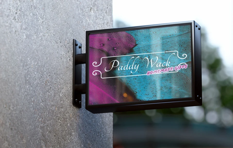
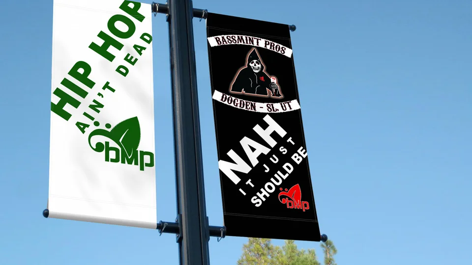
The examples shown here include PaddyWack Homemade Gifts sign artwork, an environmental campaign billboard presentation, Bassmint Pros graphics, and identity work for Sooo Good Lemonade and TCA Transportation LLC.
These existing Galactic portfolio selections offer different ways to assess emphasis, visual character, and recognition. They are not presented as Des Moines commissions. Mockups demonstrate an application rather than verify an installation or a particular marketing result.
Use the work and studio background to discuss your requirements. Ask how the proposed layouts will handle your content and how the delivery will support your team's workflow. Clear scope and review responsibilities are useful evidence alongside the visual examples.

Choose a local expression that fits the offer
The city's economic development page describes both waterfront and Pacific Highway commercial settings. The visual tone for a visitor-facing shop may differ from that of a service business communicating with regular customers, even within Des Moines.
Use local imagery when it adds meaning. A coastal illustration can support the right message, while a clear product image or service diagram may be more useful for another business. Choose the subject based on the decision the piece needs to support.
If you also reach nearby audiences, explore SeaTac graphic design and Kent graphic design. The Des Moines digital services overview explains how the materials connect with identity and a useful online destination.
Des Moines graphic design questions
Can one campaign work across print and social media?
Yes. Keep the central message and identity consistent while adapting the layout and content length to each placement. Review the important conditions in every version.
Should every piece contain the full offer?
Include enough information to make the message accurate and useful. A short piece can lead to a fuller explanation, but it should not omit a condition that changes the reader's understanding.
Can we update future announcements ourselves?
Discuss editable templates during planning. Agree on the software, fields your team changes, and guidance needed to preserve the design and keep the information consistent.
How do we make a QR code useful?
Explain what the reader will find and link to a relevant maintained page. Test the code at the intended size and give the piece enough context to remain understandable on its own.
What should be checked before sending files to print?
Approve the content, dimensions, images, links, and supplier requirements. Review the appropriate proof and confirm who handles ordering and delivery before production proceeds.
Make the message easy to recognize and act on
Give your Des Moines business materials a clear purpose.
Bring the offer and the places you need people to see it. We can create a coordinated set that communicates clearly, supports a useful response, and remains practical for your team.
Plan your Des Moines graphics