

Make practical information easier to use
Graphic design for Kearns, Utah businesses
Galactic Digital Studios provides graphic design for businesses in and serving Kearns, Utah. We create readable print and digital materials that explain services, organize practical details, and make the business recognizable. A useful piece should help someone understand the message without needing a staff member to translate the layout.
The Utah Olympic Oval in Kearns combines public activities and learning programs with its sporting role. That is one example of the community's varied activities; your business materials should address the needs of your own customers.
We design around the information people use. Clear hierarchy can make a short guide, introductory handout, or digital graphic more helpful before a customer books, buys, or asks for further detail.
Choose an order that helps the reader
Can someone identify the important details at a glance?
The purpose comes first
Make the service or message apparent before adding decorative detail. Readers should understand why the material matters to them without interpreting an unexplained headline.
The conditions stay visible
Put relevant qualifications near the information they affect. A layout should not make the main offer prominent while pushing essential details into unreadable text.
The next step is clear
Explain what the reader can do with the information. A preparation guide, service introduction, and promotional piece may each need a different action.
Give service guides and customer instructions a consistent structure
A service overview can introduce the offer, while a separate preparation card explains what a customer needs before the next stage. A digital graphic may highlight the most relevant point and lead to the fuller explanation. Each piece should have enough context to make sense on its own.
For a hypothetical Kearns household-service provider, a short guide might distinguish what is included from optional work. A hypothetical workshop instructor could need a clear sequence for getting ready. These are possible communication briefs, not Galactic client claims or instructions for a particular activity.
Use descriptive labels and a readable order. Icons and color can reinforce meaning, but they should not be the only way to understand a distinction. Realistic text lengths, headings, and spacing make the design more useful when the material changes.
Consistent graphics support recognition across the website, documents, and in-person conversations. Accurate information helps establish credibility and can lead to better-informed inquiries. A reusable approach also supports future growth by making new materials easier to connect with the same business.
Readability is part of the design direction
Our approach begins with the information the reader needs
We review the audience, purpose, existing identity, and intended format. We ask what someone should understand first and which details affect the next action. That helps establish a content hierarchy before we choose the visual treatment.
We work with actual wording rather than idealized placeholders. A useful layout has room for clear explanations and important conditions. We check how the piece reads at its intended size, not only when enlarged on a design screen.
We adapt the design to print and digital use as needed. Paper, folds, trim, and image quality matter for production. Small-screen viewing may require shorter content and a different arrangement. Editable templates add software and guidance requirements that should be agreed during scoping.
Essential service information should also be available as readable website content. Graphics can support discovery and recognition, while accurate on-page explanations serve customers arriving through search or AI-assisted research. Keeping the wording aligned helps prevent different materials from making conflicting promises.

Plan the files around how the material will be used
List the pieces you need and the questions each should answer. A service sheet, preparation guide, and promotional graphic are different deliverables. Prioritize formats that have a realistic place in the customer experience.
Gather approved descriptions, identity files, and images with permission to use them. Confirm who verifies service terms and preparation requirements. The designer can organize the explanation, while your team confirms the underlying facts.
Discuss finished exports, source files, editable versions, software, and relevant licenses. Clarify printing responsibilities and proof approval. If your team will update the material, identify which changes fit the template and which require review.
Cost and timing depend on content readiness, format count, custom artwork, adaptations, and feedback. Coordinate Kearns web development for related online information and logo design if the identity needs attention. Define future updates separately from the initial design work.
Test the explanation before producing every version
From customer information to useful design files
Define the reader and purpose
Review the message, available assets, intended formats, and production needs. Agree on what the piece should help someone understand or prepare.
Design a representative layout
Establish the hierarchy with real content. Review whether the main message, supporting details, and next step remain clear at the intended size.
Adapt and check the set
Extend the approved direction to agreed formats. Review consistency, factual accuracy, image quality, and practical variations with consolidated feedback.
Deliver for everyday use
Prepare appropriate exports and any agreed editable files. Explain routine updates and distinguish working files from final files ready for distribution or production.
Look for hierarchy and recognition across different formats
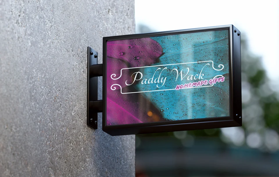
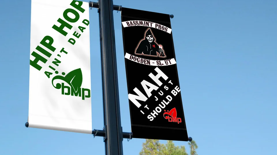
Selected imagery includes an environmental campaign billboard presentation, Paddy Wack Homemade Gifts and Bassmint Pros graphics, and Sooo Good Lemonade, The Silver Guardian, and TCA Transportation LLC identities. These portfolio examples provide varied contexts for reviewing information hierarchy and visual character.
They are not Kearns commissions or examples of the preparation guides described here. Mockups illustrate applications rather than verified installations. No measured campaign or sales result is claimed.
Explore the studio background and ask how the proposed design serves your actual content. Readability, production suitability, and clear delivery responsibilities matter alongside appearance.

Represent the business without overstating its local connections
The Kearns Historical Society describes the community that developed after the military base. Local history can inform a story when relevant, but it should not imply that a newer business shares that institutional history.
Choose imagery and language that fit your actual audience. A material can feel locally appropriate without using military or sporting symbols. Clear descriptions of service and coverage are often more useful than a decorative landmark reference.
For wider coverage, explore Midvale graphic design and Salt Lake City graphic design. The Kearns services overview connects the materials with your website and identity.
Kearns graphic design questions
Can you design a guide that explains what customers need to prepare?
Yes. Your team supplies and verifies the requirements, and the design organizes them in a useful sequence. Keep the guidance proportionate to the customer's next action.
Should we use icons instead of written instructions?
Icons can reinforce a message, but essential instructions should remain clear in words. Avoid relying on a symbol or color alone when misunderstanding would affect the customer.
Can our team edit the finished materials?
Editable versions can be included when appropriate. Agree on the software, editable areas, and guidance, with design review for changes that affect hierarchy or readability.
Do print and digital materials need different files?
Often they do. Production dimensions, resolution, and viewing conditions differ. Identify the actual destinations before deciding which layouts and exports are needed.
Can the design work with our current logo?
Yes, when the identity still fits and suitable files are available. Review inconsistencies first so new materials strengthen the same recognizable business presentation.
Make useful information easier to follow
Give your Kearns business materials a clearer structure.
Bring the service details and instructions your team explains regularly. We can turn them into readable graphics that help customers understand the offer and prepare for the next step.
Plan your Kearns graphics