
Fresh messages with a consistent identity
Graphic design for Gig Harbor, Washington businesses
Galactic Digital Studios provides graphic design for businesses in and serving Gig Harbor, Washington. We create coordinated print and digital materials that make your message clear without losing the character of the business. Whether you need a lasting service guide or a timely promotion, the work should be easy to recognize and useful to the intended reader.
The city's economic development plan identifies retail, healthcare, and specialty businesses within its service economy. That range calls for different kinds of information, rather than one visual formula for every organization.
We start with the message and its lifespan. A temporary announcement and an everyday business document can share a visual language while giving different information the emphasis it needs.
Decide what changes and what stays familiar
Can each new piece feel fresh without starting over?
A clear recurring identity
Keep recognizable elements consistent across materials. The reader should be able to connect a new promotion with the same business they saw on a previous visit.
A focused message
Give the piece one primary job. A small graphic cannot explain an entire business, announce every service, and carry every practical detail with equal emphasis.
A plan for changing information
Dates, offers, and availability need an update process. Build the layout around realistic changes instead of treating every revision as an unexpected design problem.
Build a family of materials around the way you communicate
A lasting brochure can explain the core service while a smaller card highlights a current offer. A digital graphic can introduce the same message in a format suited to quick viewing. The hierarchy changes with the format, but the identity and terminology remain connected.
For a hypothetical Gig Harbor independent shop, an ongoing business introduction might sit alongside graphics for a limited collection. A hypothetical instructor could need a stable service guide and a flexible class announcement. These are possible briefs, not local client claims or assumptions about actual schedules.
Plan reusable elements thoughtfully. A template should make routine changes easier without allowing every update to produce a different visual style. Longer titles, extra conditions, and realistic image proportions need to be considered before the layout is approved.
Consistent materials support branding and credibility as people encounter the business in different places. Clear information can make an inquiry more relevant and a recommendation easier to share. Design supports visibility and growth when the offer and distribution plan are equally considered.

A flexible structure with clear priorities
Our approach connects the message, format, and update cycle
We review the audience, purpose, existing identity, and where the material will appear. We ask what the reader should understand first and which details will change. That establishes a useful brief before choosing the visual direction.
We design with representative wording and actual content lengths. Typography, spacing, contrast, and imagery create a hierarchy that works at the intended size. Important conditions should remain readable rather than be pushed into the smallest available space.
We adapt the work for its real applications. Print may involve folds, trim, paper, and production specifications. Digital use requires attention to small screens and the surrounding platform. An editable version adds software and guidance requirements that should be agreed in advance.
Essential service information should also appear as readable website content. A graphic can introduce an offer, while the website provides the fuller explanation for customers arriving through search or AI-assisted research. Consistent wording helps prevent the two versions from making different promises.

Agree on the formats and the changes your team needs to make
List the materials you actually plan to use, along with their purpose and expected lifespan. Prioritize the formats that support current business activity instead of producing a large collection without a distribution plan.
Gather approved copy, identity files, and images with appropriate permission. Confirm who approves dates, service terms, and other changing details. A coordinated set can still become inconsistent if different people edit the underlying information independently.
Clarify finished exports, editable templates, software, source files, and relevant licenses. Define who arranges printing and approves production proofs. Template guidance should explain the boundaries that preserve readability and visual consistency.
Budget and timing depend on content preparation, the number of formats, custom artwork, and review. Coordinate Gig Harbor logo design when the identity needs attention and web development for the online explanation. Discuss ongoing adaptations separately from the initial set.
Make the system useful before extending it
From a focused message to coordinated design files
Define the audience and uses
Review the message, available assets, intended formats, and update needs. Agree on which pieces matter first and what each one should help the reader understand.
Design a representative piece
Establish the visual hierarchy using realistic content. Test whether the identity is recognizable and whether important information remains clear at the intended size.
Adapt and review the set
Extend the approved direction across the agreed formats. Review consistency, copy accuracy, image quality, and practical variations before preparing final files.
Deliver for production and reuse
Provide the agreed exports and any editable files or guidance. Identify routine updates and the changes that need further design review.
Review how the same design principles work at different scales
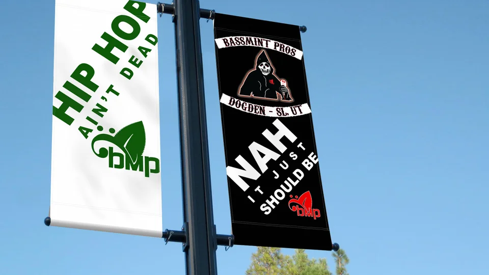
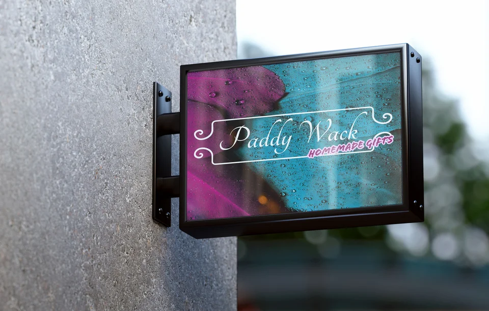
Selected examples include Bassmint Pros and Paddy Wack Homemade Gifts graphics, an environmental campaign billboard presentation, and The Silver Guardian, Sooo Good Lemonade, and TCA Transportation LLC identities. These portfolio pieces offer varied contexts for examining hierarchy and visual character.
They are not Gig Harbor commissions or evidence of measured promotional results. Mockups demonstrate applications rather than verified installations, and the examples are not presented as editable templates.
Explore the studio background and ask how a proposed design would support your actual content. A useful discussion covers readability, adaptation, and everyday use alongside appearance.

Choose local references that fit the message
The city's Harbor plan describes maritime traditions and local shops and services. Those references can inform a visual direction when relevant, but every Gig Harbor business does not need nautical graphics.
Let the audience and offer determine the imagery. Use accurate descriptions for photographs and project examples. A locally appropriate mood should not imply a waterfront location, event involvement, or business relationship that does not exist.
Related pages cover Tacoma graphic design and Port Orchard graphic design. Return to the Gig Harbor services overview to plan the wider presentation.
Gig Harbor graphic design questions
Can we reuse a design for changing offers?
Yes, if the layout is planned for the variations you need. Identify editable content and test realistic changes before treating the design as a reusable template.
Should every promotion use the same layout?
Not necessarily. Consistent typography, colors, and identity can connect different layouts. Let the message and format determine the arrangement while preserving recognizable elements.
Can our team update dates and wording?
An editable version can support routine changes when included in the scope. Agree on software and guidance, and identify changes that require design review.
Can one file work for print and digital use?
Often an adaptation is more useful. Print production and small-screen viewing have different requirements, so plan the actual destinations before choosing final exports.
What should we supply before design begins?
Bring the intended message, approved details, existing identity files, suitable images, and required formats. Identify who will review accuracy and consolidate feedback.
Keep the message clear as the details change
Give your Gig Harbor graphics a more consistent foundation.
Bring the materials you use regularly and the promotions you need to support. We can create coordinated designs that make the business recognizable and the information easier to act on.
Plan your Gig Harbor graphics