
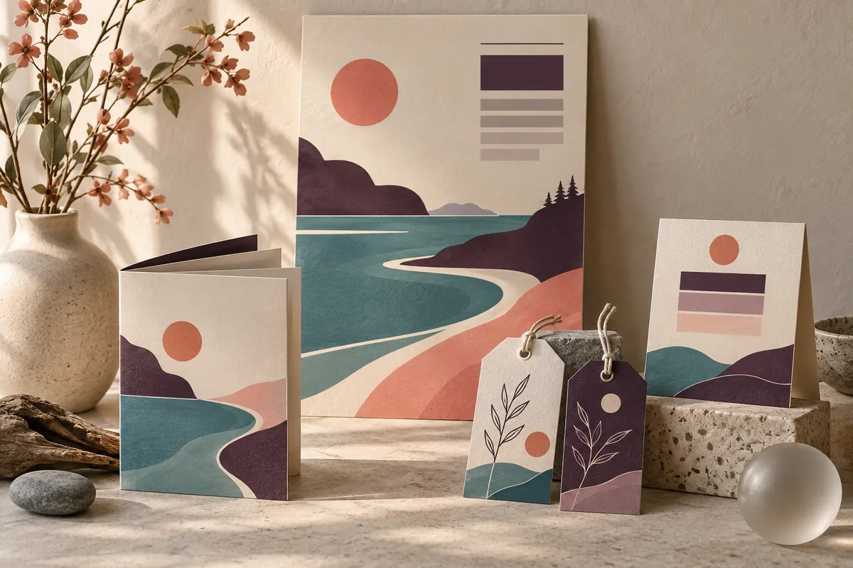
A recognizable thread through every piece
Graphic design for Bainbridge Island businesses with something worth sharing
Galactic Digital Studios provides graphic design for small businesses in Bainbridge Island, Washington. We help shape announcements, sales materials, digital graphics, and print artwork into communication people can follow. The work begins with what you want to say, who needs to hear it, and where the design will appear.
On Bainbridge, the same business may introduce itself to a new visitor while keeping an ongoing conversation with local customers. The Bainbridge Island Downtown Association describes its work around independent businesses, community events, residents, and visitors. That mix makes consistency useful: an event piece can feel fresh while still belonging to the business people already recognize.
We collaborate remotely with island owners and teams, bringing your knowledge of the audience into the design brief. Whether you need a single important piece or a coordinated group of materials, the starting point is a clear communication task and a manageable scope.

One message, different reading conditions
Plan the design around where people encounter it
A quick glance
A poster, window piece, or digital announcement needs a clear main message. A viewer should recognize the subject before reading the details. Large type and deliberate spacing help establish that order.
A closer look
A brochure or service sheet can carry more explanation. Organize that detail into useful groups so the reader can compare options and understand the next step without being faced with an uninterrupted block of information.
A familiar reminder
Recurring communications benefit from recognizable elements. Consistent type, colors, and imagery can connect a new message with previous encounters, even when the format or occasion changes.
Give a short-lived announcement a durable foundation
Consider a hypothetical Bainbridge shop preparing an in-store demonstration. It might need a small counter sign, a social graphic, and a printed handout. The date and event details will expire, but the visual identity should continue working for the next announcement. Planning the shared elements helps separate the changing information from the lasting brand decisions.
The formats still deserve individual attention. A square graphic cannot always become a narrow sign through cropping. A handout may need context that would overload a poster. We establish the main message, then adapt the hierarchy to the amount of space and the way each piece will be read.
Bring the complete asset list into the conversation early. Include quantities of designs, intended placements, required sizes, and any versions for different audiences. Knowing the family of materials before design begins helps avoid a finished piece that cannot comfortably accommodate its next application.
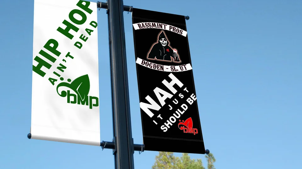
Keep the message in focus
Use visual character to make information easier to understand
Galactic’s approach starts with a simple order: what needs to be noticed first, what helps explain it, and what action follows. We use typography, image choice, color, and space to make that order visible. Your business’s personality informs the treatment without replacing the need for readable information.
A quieter design might suit a detailed service introduction, while a bolder composition could help an announcement stand out. The choice should follow the audience and placement. We can explore expressive artwork without assuming that every island business should use coastal imagery or the same natural palette.
Good graphics can strengthen visibility, reinforce branding, and make an offer feel more credible because its details are easier to assess. They support inquiries when the message and next step are clear. The commercial result also depends on distribution and the offer itself, so we evaluate the communication rather than promise sales from a visual treatment.
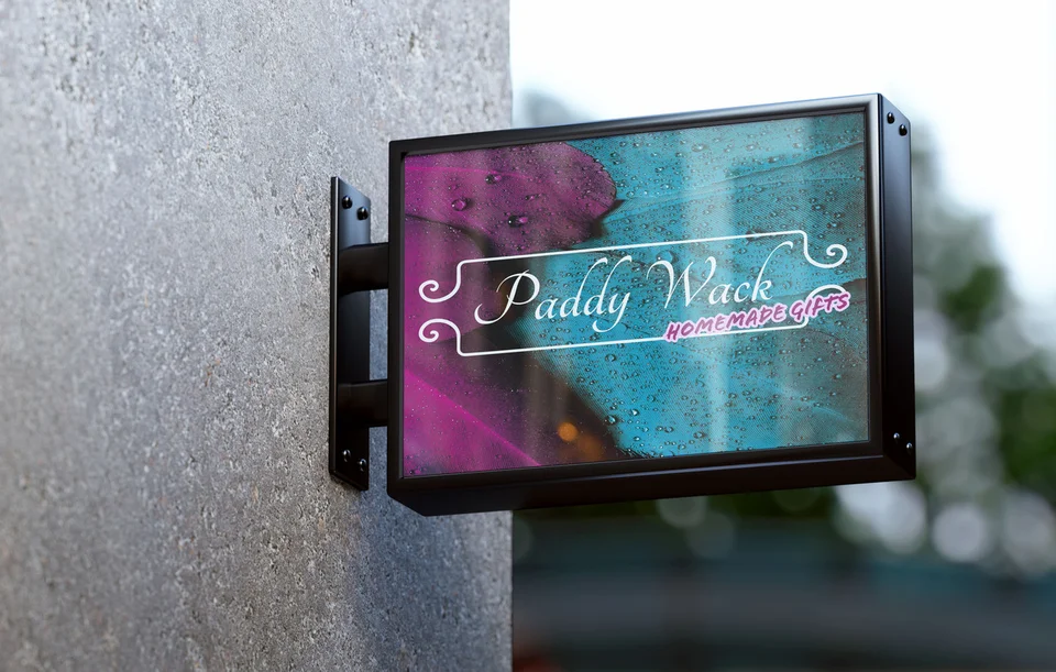
Make production decisions before the last revision
Print artwork needs to be prepared for its intended output. Obtain the provider’s dimensions, bleed requirements, and file specifications before final delivery. Paper choices, folds, and viewing distance may affect how a layout should be designed. Clarify whether the project includes vendor coordination or only the agreed artwork.
For digital pieces, identify the actual placements and the information each needs to carry. Keep essential website content in readable text alongside any graphic. If a printed piece includes a QR code, give it a clear purpose, confirm the destination, and test it at the intended size. A working route to useful information matters more than simply including the code.
Editable templates require their own planning. Discuss the software your team uses, the parts they expect to change, and which fonts or images need licensing. A reusable file should be understandable to the person maintaining it. Ask what files, rights, and guidance are included rather than assuming every design package contains the same handoff.
Related work may affect the timing. Bainbridge Island logo design can establish the identity first, while web development can prepare the page a campaign points people toward. Coordinating those pieces helps create a complete customer experience.
From brief to ready-to-use artwork
A workflow built around clear approvals
Gather the message and materials
Review the audience, purpose, approved text, existing identity, and required formats. Identify missing imagery or information and decide who is responsible for supplying or creating it.
Develop the visual direction
Explore a representative piece that establishes hierarchy and character. Explain the choices against the brief so feedback can focus on the message and the way the design will be used.
Adapt and refine
Apply the approved direction to the agreed formats. Review content accuracy and layout changes across versions. Consolidated feedback keeps the pieces coordinated and avoids conflicting revisions.
Prepare and explain the files
Check output requirements, approved text, and file organization. Deliver the agreed formats with their intended uses clear. Confirm any production proofing or future adaptations that remain the responsibility of another party.
Evaluate the communication, not just the presentation
The portfolio selections here include an environmental campaign billboard presentation, a Bassmint Pros banner presentation, a Paddy Wack Homemade Gifts sign mockup, and identity work. They offer different examples of hierarchy, scale, and visual personality. Captions distinguish graphic presentations from logo examples.
These are existing Galactic portfolio selections, not claimed Bainbridge Island commissions. Mockups show a proposed presentation of artwork and should not be read as evidence of physical installation or measured campaign performance. They are useful for discussing design choices and the applications that matter to you.
Galactic’s roots go back to 2015, with a service mix that connects graphic design, identity, and websites. View the wider portfolio and ask how a proposed direction would work in your actual formats. Clear reasoning, deliverable definitions, and an organized review process provide practical grounds for choosing a provider.
Keep the brand familiar when the audience changes
A resident who sees your materials regularly may recognize the name immediately. A first-time visitor may need a short explanation of the offer. A useful design system can accommodate both by preserving the identity while adjusting the information hierarchy.
For businesses communicating beyond the island, see our Seattle graphic design and Port Orchard graphic design pages. The Bainbridge Island services overview connects this work with a broader website or identity project.
Growth does not have to mean replacing the visual direction each time the business adds an offer. A well-considered foundation can make new materials more coherent and easier to commission. The system should be flexible enough for new information while retaining the recognizable elements that give it continuity.

Bainbridge Island graphic design questions
Can you design a matching set of print and digital pieces?
Yes. Define the full list of formats and placements first. They can share a visual direction while using different arrangements suited to the amount of space and the way people read each piece.
What if the event details are still changing?
Identify which details are confirmed and when the rest will be approved. Early exploration may be possible, but text changes can affect layouts. Set a clear final-content stage before production files are prepared.
Can we reuse the design for future announcements?
Discuss reuse before the project starts. A template may be appropriate, but it needs to suit your team’s software and editing skills. Agree on editable files, licensing, and which changes the layout is designed to support.
How much does a graphic design project cost?
Cost depends on the concepts, formats, adaptations, content work, and review requirements. A clear list of deliverables makes the estimate meaningful. Printing and other production expenses should be identified separately where applicable.
How far ahead should we begin?
Work backward from the date the materials must be in use, including review and vendor production time. Share that date at the start so the scope and dependencies can be assessed realistically.
Make the next message count
Give your business a visual voice people can follow.
A single piece can solve an immediate need. A thoughtful family of materials can make the next one easier too. Bring your Bainbridge Island project, its audience, and its deadline, and let’s define the right design work.
Plan your design materials