

Put the message to work
Graphic design for Auburn’s customer-facing and commercial businesses
Galactic Digital Studios provides graphic design for businesses in Auburn, Washington, helping turn offers, capabilities, and announcements into clear visual communication. We work on the relationship between message and format, whether the piece is a digital graphic, a business card, a banner, or a sales document. The result should make the next conversation easier, not leave someone wondering what the business actually offers.
Auburn combines downtown commerce with a wider industrial and regional business setting. The city’s Downtown Urban Center information describes a focus on arts, culture, and public spaces. That context suggests a different communication problem from a supplier explaining technical capabilities to another business. Both need clarity, but the message, pace, and application can differ.
We collaborate remotely with Auburn owners and teams. Bring the material you use today and explain where it falls short. A practical design brief often starts with an everyday problem: the flyer is crowded, the sales sheet is hard to update, or every new graphic looks like it belongs to a different company.

Choose the format around the decision
Introduce the business
A business card or introductory piece needs a clear identity and a sensible information hierarchy. It should connect with the website and other materials instead of creating another visual version of the business.
Explain an offer
A campaign graphic or banner should make the main message obvious. Supporting information needs enough room to be useful without competing with everything else. The audience and placement determine how much detail belongs there.
Support a sales conversation
A capabilities document may need structured information that a buyer can scan and share. Graphic design can organize those details so the reader understands the offer without needing a verbal explanation of every section.
Define the use before choosing the style
Imagine an Auburn business preparing both an event graphic and a document for prospective commercial customers. The two pieces may share a visual identity, but they have different jobs. One needs to attract interest quickly; the other may need to support a careful comparison. Treating them as the same layout with different text can weaken both.
For each piece, identify the intended audience, the action you want, and the setting in which it will be read. Will someone see it at a distance, on a phone, in an email, or as a printed handout? How much information can they realistically absorb in that setting? These answers help determine hierarchy, scale, and the number of required versions.
Agree on content responsibilities early. Product details, approved claims, dates, and spelling should have an owner. If photography, copy development, or additional brand work is needed, identify that as part of the scope. A design schedule cannot reliably absorb unknown content dependencies without discussion.
Clarity is a design decision
Make the important information easier to find
Our strategic approach starts by deciding what the reader needs to notice first, what helps them understand it, and what comes next. We use typography, spacing, color, and imagery to establish that order. A visual choice earns its place by helping the message, not simply because it fills an empty corner.
Consistency is particularly useful when several people create or distribute materials. A small set of clear visual rules can help the sales document, website graphic, and printed piece feel connected. We can discuss the level of guidance or reusable material the project needs rather than assuming that one final image solves every future application.
Well-organized graphics support visibility and credibility by making information easier to notice and assess. They also reinforce branding across repeated encounters. Their effect on leads and growth depends on the offer and how the pieces are used. We focus on communication problems the design can address instead of promising a commercial result from artwork alone.
Plan the handoff before the file is finished
Print and digital work require different preparation. A graphic that looks clear on your monitor may not be suitable for a large physical application. Ask the production provider for dimensions and file requirements before final delivery, and confirm who is responsible for checking those specifications.
For digital assets, define the placements and sizes that are actually needed. Keep essential website information in readable HTML as well as any supporting graphics. An image should complement the message, not become the only place a customer can find an important service detail. That also makes the information easier to understand when read outside its visual layout.
If the logo or identity needs work first, explore logo design in Auburn. If the artwork is part of a website update, our Auburn web development page explains how content and visual assets fit into the larger experience.
A manageable design workflow
Move from a clear brief to usable materials
Inventory and prioritize
Review current assets and identify the pieces the business needs most. Specify the audience, message, placement, and approval process. Collect existing identity files and any production requirements.
Build the visual hierarchy
Develop a direction that gives the message a clear order. Review how imagery, type, and spacing work together. Assess the design in relation to its actual application rather than only as a large presentation image.
Refine and prepare versions
Use consolidated feedback to resolve communication issues. Adapt the approved direction to the agreed formats. Different proportions may require a new arrangement, not just an automated crop.
Check and deliver
Review approved text, dimensions, and output formats. Clarify which files are intended for which uses and whether editable materials are included. Future adaptations can then be planned against a known set of assets.
Use portfolio examples to discuss real choices
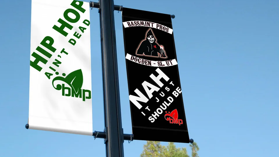
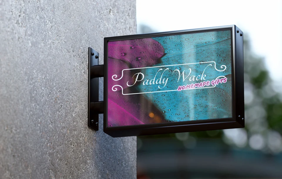
The selected work here includes an environmental campaign billboard presentation, Bassmint Pros banner artwork, a Paddy Wack Homemade Gifts sign mockup, and identity examples. These come from Galactic’s existing portfolio. They are not described as Auburn clients or evidence that presentation mockups were physically installed.
Each example gives you something to examine: the balance of text and imagery, the order in which information is noticed, and how an identity works in a particular setting. Those observations can help explain the kinds of choices you want to explore for your own materials.
Galactic combines graphic design with logo work and web development, with roots dating to 2015. Visit the portfolio and ask about the disciplines relevant to your project. Evidence of visual work is useful; claims about sales results require different evidence and should not be inferred from a mockup.

Keep a recognizable system as the message changes
A business may use different offers or event details across Auburn and nearby communities. The changing information should be easy to distinguish while the identity remains recognizable. Organizing that relationship can make future materials less time-consuming to plan.
See our Kent graphic design and Federal Way graphic design service pages for nearby areas, or return to the Auburn services overview to consider a broader project.
Local relevance should come from accurate details and an understanding of the customer. For example, a downtown event piece might need a very different reading pace from a supplier document. These are potential use cases to discuss, not a reason to decorate every Auburn project with the same city imagery.

Auburn graphic design questions
Can you make our existing materials look more consistent?
Yes. Share the materials together so we can assess differences in typography, colors, imagery, and layout. The project may involve a focused cleanup or a more deliberate visual system, depending on what is causing the inconsistency.
Do you need finished text before starting?
The message and content responsibilities should be clear early. Some exploration can happen with a draft, but substantial text changes can affect layout and timing. Agree on what will be supplied and when it becomes final.
Can our team edit the designs afterward?
Discuss that requirement before the project begins. Editable files, template setup, fonts, and image licensing can affect future use. The handoff should specify what you receive and what tools are needed.
Is printing part of the design fee?
Printing is not something to assume. Design, file preparation, vendor coordination, and physical production need clearly assigned responsibilities. Share production requirements and confirm the scope before work starts.
How do you price a set of graphics?
The work depends on the number of distinct concepts, formats, adaptations, content needs, and review rounds. A set of related sizes is different from several separate campaigns. A clear asset list makes the estimate more useful.
Make the next piece count
Give your message a design people can follow.
Whether you need one important graphic or a more consistent family of materials, start with the audience and the job the design needs to do. We’ll help define a practical direction for your Auburn business.
Plan your graphic design project