

Historic streets and new materials call for clear hierarchy
Ogden’s Make Ogden plan emphasizes downtown streets and Union Station, while the general plan looks at broader business districts. A sidewalk poster has seconds to communicate; a sales sheet can explain scope; a digital card must remain legible on a phone. Format should follow the reader’s setting.
A hypothetical Historic 25th Street retailer could use a window notice with current hours. A neighborhood service business might need a comparison of options. A manufacturer could use a concise capability sheet for a buyer. These identify design jobs; they are not Ogden client work.
Galactic Digital Studios develops graphic materials that make the offer easier to understand across print and digital use. The piece should help someone take a real next step, not merely fill space.
Choose one clear job for the first piece
A storefront card may need product categories and visit details; a service comparison may need exclusions; a capability sheet may need requirements and a contact step. Each supports a distinct decision. Trying to force every job into one brochure often hides the detail a reader came for.
Ask what the reader needs to know and what they should do afterward. If specifications or availability change, point to a maintained Ogden website for current detail. A printed piece should not make a promise the business cannot keep updated.
Hierarchy matters: important qualifications belong near the claim they modify, not in tiny text. Readable type, contrast, and spacing should make the information usable at the intended size.

Prepare a brief that survives production
Begin with the reader, the setting, and the action the piece supports. Is this a window notice seen in passing, a menu held at a counter, a project sheet sent after a call, or a presentation shown on a screen? Include final dimensions, distribution method, approved copy, available imagery, and any vendor specifications. Those details determine hierarchy before color choices do.
For a downtown event piece, verify the date, location, accessibility details, and organizer before layout. For a service guide, confirm what is included, what changes, and where current terms live. The business owns factual approval and rights to supplied photos or marks. Design can make information legible; it cannot certify the underlying claims.
Compare proposals by exact formats, size adaptations, editable files, copy work, review stages, and print preparation. A PDF for email and a file for a print vendor may require separate checks. Cost and timing depend on the number of applications, source readiness, and approval complexity. Put those assumptions in writing so the handoff is useful.
Create a visual system that serves the message
We organize the reading order first: what catches attention, what explains the offer, and what tells someone what to do next. Type scale, spacing, color, and imagery then reinforce that order. A small sidewalk card should not rely on a dense paragraph; a detailed capabilities sheet should not omit the qualifiers a buyer needs.
The Ogden arch illustration in the hero is an editorial depiction of a public landmark, not a sample of work for the city. The supporting portfolio images are separate examples of Galactic work. This distinction matters when choosing references for your project: a compelling visual treatment is not evidence that a particular campaign was installed or produced a measurable result.
Existing brand rules should carry across layouts when they remain readable. If the logo has weak small-size performance, resolve that before repeating it on dozens of pieces. Ogden logo design can establish usable variants; the graphic system then applies them without making every item identical.

Let’s make one important Ogden capability or service explanation easier to use.
Adapt the material to each channel
A handout, presentation, sign, and social post share a message but not a single set of dimensions. Test type at the actual reading distance and file size. Keep essential words available outside artwork for accessibility and future updates. Where a piece points to detailed or changing information, link it to a maintained website.
A product comparison can use columns if the differences are few and the print size allows them. A service process may work better as a short sequence. A data-heavy page might need a source note and a named reviewer. Choose a structure that makes the reader’s next decision easier rather than a format that merely fills a page.
Mockups are useful for checking visual direction, but they are not proof of installation. Inspect final files for bleed, resolution, color mode, and vendor requirements when printing is part of the scope. Store approved versions where staff can find them and retire outdated variants.
If several people distribute the same sheet, decide what can be customized and what should remain fixed. Contact names may change while service limits and qualifications need a controlled source. This routine keeps a clear design from turning into several contradictory versions.
Review the piece in the form people will receive
Discovery gathers the actual reader task and approved source facts. Direction tests a visual hierarchy against that task. Creation develops the selected applications. Feedback checks both the meaning and the real size. Delivery supplies the formats named in the proposal and any usage notes needed for future updates.
For a downtown-facing piece, ask someone unfamiliar with the business to find the location and next step quickly. For a technical sheet, ask the responsible employee to check every number, limitation, and diagram. A beautiful draft can still fail if the reader cannot act on it or the facts are stale.
Timing depends on source material, number of pieces, production requirements, and reviewer availability. Allow time for the business to approve changing facts and for the vendor to verify print specifications. The final review should take place in the intended medium, not only on a large design monitor.
Look at real examples for relevant choices
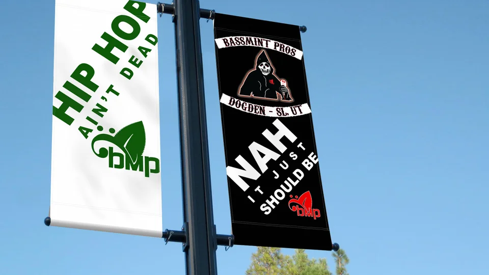
The Galactic portfolio includes Bassmint Pros and Paddy Wack Homemade Gifts graphic presentations, along with identity applications for Sooo Good Lemonade and The Silver Guardian. These are not Ogden commissions or measured sales results. Some presentations are mockups, not confirmed installations.
Ask which format and hierarchy would serve your reader. A technical sheet and a neighborhood service guide should not have the same density or next step. Our studio background adds context.
For nearby Utah context, see North Ogden and the service areas directory. Claims about your own service territory should match actual operations.

Questions about graphic design in Ogden
What should we design first?
Choose the piece that answers a recurring customer question or supports a specific sales step. Format follows use.
Can you use our current logo?
Often, after checking file quality and legibility across the planned applications.
Are print-ready files included?
That should be specified in the scope. Share vendor dimensions and requirements before final artwork.
Who approves technical claims?
The business confirms specifications, prices, policies, and service terms. Design can clarify them but cannot validate them.
Can one system work in print and digital?
Yes, but each format needs its own layout, dimensions, and accessibility checks.
Ready for a useful next step?
Give every customer-facing piece a clear purpose.
Tell us what customers need to understand and where your current materials fall short. We can discuss a focused scope for your Ogden business and the information needed to begin.
Discuss your Ogden project